Reflection Effects On Images Or Text Using CSS
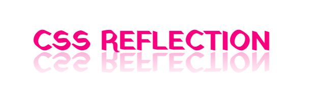
In CSS, the -webkit-box-reflect property creates a mirror-like reflection below an element, often used for images, text, or graphics.
CSS reflections are a great way to add depth and visual interest to your web design. In this tutorial, we will cover the basics of CSS reflections and show you how to create stunning reflection effects.
Note: It is important to mention that the -webkit-box-reflect property may not be supported in all browsers.
Contents
Here is a simple example of CSS reflection:
Syntax:
-webkit-box-reflect: <direction> <offset> <mask-box-image>;- <direction>: Determines the direction of the reflection, which can be specified as either above, below, left, or right of the content box.
- <offset>: Defines the distance between the content and its reflection.
- <mask-box-image>: Specifies an image to use as a mask for the reflection, allowing for more intricate reflection effects.
Direction
Specifies the direction of the reflection, such as above, below, left, or right
-webkit-box-reflect: below,above,left,rightDemo Preview reflect direction
Offset
Defines the distance between the element and its reflection.
-webkit-box-reflect: below 10px;-webkit-box-reflect: below -1px;Demo Preview reflect Offset
Mask With Gradient
Specifies an image to be used as a mask for the reflection, allowing for additional customization. fade-out effect on the reflection.
-webkit-box-reflect: below 1px linear-gradient(to bottom, transparent, #FFFFFF);opacity
The -webkit-box-reflect attribute in CSS does not directly adjust reflection opacity, but you can mimic this effect using a mask-box image with a gradient. Here is an example.
-webkit-box-reflect: below 1px linear-gradient(to bottom, transparent, rgb(255 255 255 / 50%))color-stop
-webkit-box-reflect: below 1px -webkit-gradient(linear, left top, left bottom, from(transparent), color-stop(45%, transparent), to(#FFFFFF))Demo Preview reflection with gradient
Easily generate reflection effects for your text or images. Simply add your content below, and we will create the CSS code for you.
How to Use This Tool
- Select the element you want to reflect (Text or Image).
- Enter your text or upload an image from your device.
- Choose the reflection direction (Below, Above, Left, or Right).
- Customize the reflection settings (Offset, Opacity, etc.).
- Copy the generated CSS code to use on your website.
Reflection code HTML and CSS
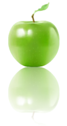
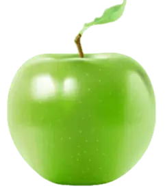
You can create a reflection effect in CSS without using the -webkit-box-reflect property. You can use different techniques like CSS transform and pseudo-elements. A popular method involves using the :before or :after pseudo-elements to create a mirrored duplicate of the element and then applying a vertical flip transformation. Let me show you a simple example of how this can be done.
Preview Example:
.reflection {
    position: relative;
    width: 80px;
    height: 90px;
    background-image: url('https://www.html-code-generator.com/images/css/apple.webp');
    background-size: 100%;
    background-repeat: no-repeat;
}
.reflection::before {
    background-size: 80px;
    content: "";
    position: absolute;
    top: 100%;
    left: 0;
    right: 0;
    background-image: url('https://www.html-code-generator.com/images/css/apple.webp');
    opacity: 0.3; /* Adjust the opacity*/
    transform: scaleY(-1); /* Flip the image vertically */
    height: 100%;
    width: 100%;
    background-repeat: no-repeat;
    z-index: 10;
    filter: blur(0px);
    margin-top: 0px;
}- This code snippet uses the ::before and ::after pseudo-elements to create a mirror reflection effect for the image.
- The transform property is used to flip the image vertically
- The opacity and filter properties are used to adjust the visibility and blur of the reflection.