CSS Filter Effects Generator
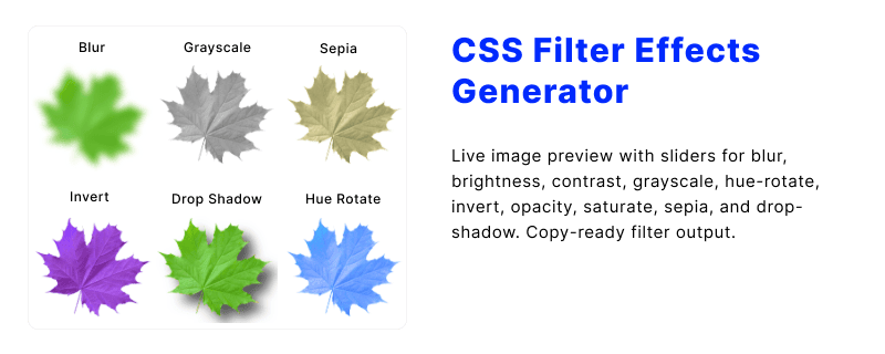
The CSS filter property applies graphical effects such as blur, brightness shifts, and color treatments to an element and everything it paints, including images, video, and nested content. This page explains how each filter function behaves and how to use the interactive generator, then walks through syntax and each function in the reference sections below.
Use the interactive controls to load a sample or custom image URL, adjust sliders for each supported function, and copy the resulting declaration when the preview matches your design.
Table of Contents
What is the CSS filter property?
The filter property lets you adjust how an element is drawn before it reaches the screen. Unlike editing the source image file, filters are non-destructive: you change the painted result in the browser and can reset or combine effects in CSS.
Filters are popular for hero photos, thumbnails, icons, and cards because a single declaration can dim, sharpen, recolor, or soften content without extra markup. They also apply to HTML elements that are not images, so text and backgrounds inside a filtered container inherit the same treatment.
- Stacks multiple functions in one declaration, separated by spaces.
- Works on replaced content (images, video) and regular boxes.
- Pairs well with
transitionfor hover and focus states. - Related:
backdrop-filterblurs or tints content behind an element instead of the element itself.
See the syntax overview for the value grammar, or open the functions reference for what each slider in the generator controls.
CSS filter effects generator
Load a sample or custom image in the live preview, tune blur, brightness, contrast, color shifts, and other supported filter functions with sliders, and copy the combined declaration when the preview matches your design.
Generated code
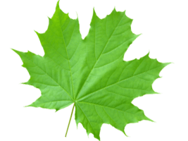
<img src="/images/demo/green-leaves.png" class="filter-effect" width="200px" height="200px" alt="">.filter-effect {
filter: blur(1.7px);
}How to use this generator
The generator section on this page mirrors the classic HTML Code Generator workflow: you pick a preview image, move sliders for each filter function, and read the combined result in the output field.
- Enter an image URL or keep the default sample so the preview has something to render.
- Adjust blur, brightness, contrast, grayscale, hue rotation, invert, opacity, saturation, sepia, and drop-shadow controls.
- Watch the preview update in real time as values change.
- Copy the generated
filterdeclaration into your stylesheet or component. - Reset sliders when you want to start a new look without reloading the page.
Order matters when several functions are active: the browser applies them left to right in the declaration. For subtle photo edits, start with exposure-style controls (brightness, contrast), then add color adjustments (saturate, sepia, hue-rotate), and finish with blur or drop-shadow if needed.
CSS Filter Effects Examples
Explore different CSS filter effects with live previews and ready-to-use code examples. From basic filters like blur, grayscale, and sepia to creative combinations, discover how to transform images using simple CSS properties. Copy the CSS code and use it in your own projects.
filter: none; filter: blur(3px); filter: grayscale(1); filter: sepia(0.85); filter: brightness(1.4); filter: contrast(1.6); filter: hue-rotate(130deg); filter: invert(1); filter: saturate(2.2); filter: opacity(0.45); filter: drop-shadow(8px 8px 5px #555); CSS filter syntax
A filter value is either the keyword none or a space-separated list of filter functions. Each function takes its own arguments inside parentheses. The generator on this page focuses on the most common image filters supported across modern browsers.
Supported function names in this tool:
blur()brightness()contrast()drop-shadow()grayscale()hue-rotate()invert()opacity()saturate()sepia()
You can combine any number of these functions in one declaration. Use none to clear filters on a selector. Details for each function appear in the filter functions reference.
Filter functions reference
Each row matches a control in the generator. Default strengths follow typical browser defaults where applicable; your preview may treat 100% or 0 as the neutral starting point.
| Function | Typical argument | Effect |
|---|---|---|
blur() | Length, e.g. pixels | Softens detail with a Gaussian blur; larger values spread the haze farther. |
brightness() | Percentage | Multiplies pixel brightness; values below 100% darken, above lighten. |
contrast() | Percentage | Expands or compresses the difference between light and dark areas. |
drop-shadow() | Offset, blur, color | Paints a shadow that follows the visible shape of the element, including PNG transparency. |
grayscale() | Percentage 0 to 100% | Removes color progressively; full grayscale yields black and white output. |
hue-rotate() | Angle | Rotates colors around the color wheel without changing overall lightness. |
invert() | Percentage | Swaps light and dark channels; partial invert keeps some original color. |
opacity() | Percentage | Adjusts transparency of the filtered result (distinct from the opacity property). |
saturate() | Percentage | Boosts or mutes color intensity; 0% is fully desaturated. |
sepia() | Percentage | Warms the image toward brown tones, similar to vintage photo prints. |
For shadow styling on rectangular cards, compare drop-shadow() with box-shadow in the section on drop-shadow vs box-shadow.
filter drop-shadow vs box-shadow
Both effects suggest depth, but they paint different geometry. Choose based on whether the shadow should trace a bitmap silhouette or the element border box.
| Topic | filter: drop-shadow() | box-shadow |
|---|---|---|
| Shape | Follows non-transparent pixels, including PNG and SVG cutouts. | Follows the border box rectangle (or rounded corners from border-radius). |
| Spread / inset | No spread or inset keywords; shadow size comes from blur and offsets. | Supports spread radius and inset shadows inside the box. |
| Stacking | Part of the filter list; combines with blur and color filters on the same element. | Independent property; multiple comma-separated layers supported. |
| Best for | Icons, logos, clipped photos, and irregular silhouettes. | Cards, buttons, panels, and uniform UI chrome. |
You can use both on different elements in the same layout. For layered card shadows and neumorphism presets, see the CSS box-shadow generator.
Common use cases
Filters solve quick visual problems without exporting new image assets from an editor. The generator helps you find balanced values before you paste them into production CSS.
- Thumbnail hover: Slightly raise brightness or saturation on hover while keeping layout stable.
- Disabled states: Combine
grayscale()and loweropacity()to mute inactive icons. - Hero overlays: Darken photography with reduced brightness so headline text stays readable.
- Brand tint: Use
sepia()plushue-rotate()for cohesive campaign color. - Soft focus: Apply
blur()on background media while foreground content stays sharp on another layer. - Sticker icons: Add
drop-shadow()on PNG icons so they lift off varied backgrounds.
For checkerboard preview backgrounds when testing transparent PNGs, try the checkerboard transparency pattern tool.
Browser support
The standard filter property is widely available in current evergreen browsers. Legacy WebKit builds once required a -webkit-filter prefix; modern Chrome, Safari, Firefox, and Edge honor the unprefixed property for the functions this tool exposes.
| Environment | Support notes |
|---|---|
| Chrome / Edge (Chromium) | Full support for listed filter functions in recent releases. |
| Firefox | Full support for standard filter functions; test performance on large images. |
| Safari / iOS Safari | Supported; verify heavy blur on mobile for smooth scrolling. |
| Internet Explorer | No filter support; provide unfiltered fallback imagery. |
If a filter is only decorative, keep the unfiltered asset visible underneath and treat the effect as progressive enhancement. Avoid stacking many strong filters on huge background images when targeting low-powered phones.
Frequently Asked Questions
Quick answers about CSS filters, how this generator outputs declarations, and how filters differ from related properties.
What does the CSS filter property do?
It applies visual processing to an element before display, such as blur, brightness changes, or color shifts. Multiple functions can run in one declaration.
Which filter functions does this generator support?
Blur, brightness, contrast, drop-shadow, grayscale, hue-rotate, invert, opacity, saturate, and sepia. Each has a dedicated slider or control in the editor.
Can I preview my own image URL?
Yes. Paste a public image URL into the preview field. The image must allow cross-origin display in the browser; otherwise the preview may stay blank.
What is the difference between filter and backdrop-filter?
filter affects the element and its descendants. backdrop-filter affects pixels drawn behind the element, often for frosted glass panels.
When should I use drop-shadow instead of box-shadow?
Use drop-shadow() when the shadow should hug irregular or transparent artwork. Use box-shadow for rectangular UI surfaces and inset shadows.
Does filter change the original image file?
No. Filters are rendered by the browser at paint time. The source file and markup stay unchanged until you edit them separately.
Related CSS tools
These generators and references pair well with image filters when you are building cards, typography, or layout polish.
- CSS box-shadow generator for card shadows, glows, and drop-shadow comparisons.
- CSS text-shadow generator for display type and headline depth.
- Checkerboard transparency pattern for PNG and SVG preview backgrounds.
- CSS border-radius generator for rounded photo frames and avatars.
- CSS tools hub for other generators and references.