CSS corner-shape Property Guide
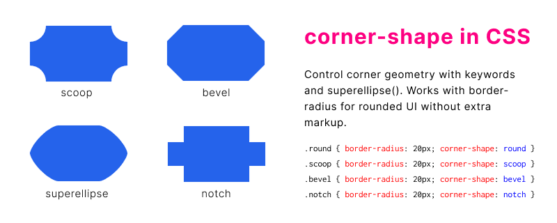
The CSS corner-shape property controls how each corner of a box is drawn when border-radius rounds or clips the border box. You can move beyond uniform circular arcs and use scoop, bevel, notch, square, or superellipse-based shapes on the same element.
This guide covers syntax, keyword values, copy-ready examples, browser support, and how corner-shape works together with border-radius for cards, buttons, and UI chrome.
Table of Contents
What is CSS corner-shape?
corner-shape is a CSS property that defines the geometry of each corner after border-radius applies. A large radius alone always follows a circular arc; corner-shape lets you choose alternate corner silhouettes such as inward scoops, flat bevels, or notched cuts while keeping the same radius lengths.
It is useful when you want distinctive UI shapes without SVG masks or extra wrapper elements.
- Works on the border box of block and inline-block elements
- Accepts one value for all corners or up to four values per corner
- Pairs with
border-radiusso the radius size still controls how large each corner effect is - Supports keyword shapes and the
superellipse()function for fine-tuned curves
See the syntax section for the full value grammar, or jump to live-style examples you can copy into your stylesheet.
corner-shape Syntax
The property accepts one to four corner-shape values in the same order as border-radius shorthand: top-left, top-right, bottom-right, bottom-left. When one value is supplied, all four corners use it.
Basic syntax
corner-shape: round | scoop | bevel | notch | square | superellipse(<number>);One value (all corners)
.card {
  border-radius: 20px;
  corner-shape: scoop;
}
Four values (per corner)
.badge {
  border-radius: 16px 32px 16px 32px;
  corner-shape: bevel notch round scoop;
}
Keyword meanings and superellipse() parameters are listed in the values reference below.
corner-shape Values
Each keyword changes how the corner path is constructed inside the radius ellipse. Use superellipse() when you need a curve between a square and a circle.
| Value | Description |
|---|---|
round | Default circular arc (same visual as omitting the property when supported) |
scoop | Concave corner that curves inward toward the element center |
bevel | Straight diagonal cut across the corner |
notch | Sharp right-angle notch removed from the corner |
square | Keeps the corner square; radius still affects clipping when combined with overflow |
superellipse(n) | Superellipse curve; values below 1 flatten, above 1 deepen the curve toward a circle |
superellipse() examples
.squircle {
  border-radius: 28px;
  corner-shape: superellipse(2);
}

.flatter {
  border-radius: 28px;
  corner-shape: superellipse(0.6);
}
corner-shape Examples
Each sample uses the same border-radius: 24px so you can compare how keyword values change the silhouette. Preview boxes use the page style.css demo classes; copy the CSS blocks into your own project.
round: default circular arcscoop: concave inward curvebevel: straight diagonal cutnotch: square notch at the cornersquare: sharp corner silhouettesuperellipse(1.5): squircle-style curveScoop card
.scoop-card {
  border-radius: 24px;
  corner-shape: scoop;
  background: #2563eb;
  padding: 1.25rem;
}
Mixed corners on a button
.cta {
  border-radius: 12px 28px 12px 28px;
  corner-shape: bevel round notch scoop;
  border: none;
  padding: 0.75rem 1.5rem;
}
Progressive enhancement with @supports
.panel {
  border-radius: 20px;
  background: #f8fafc;
}

@supports (corner-shape: scoop) {
  .panel {
    corner-shape: scoop;
  }
}
Live corner-shape creator
Adjust corner-shape, border-radius, and background color below. The preview updates immediately in supporting browsers, and the CSS block reflects your current settings for copy-paste.
Controls
Preview
Requires a browser that supports corner-shape. Unsupported browsers still show a rounded rectangle.
<div class="corner-shape"></div>.corner-shape {
border-radius: 24px;
corner-shape: scoop;
background: #2563eb;
width: min(100%, 220px);
height: 140px;
}Browser Support
corner-shape is a newer CSS feature. Support landed in Chromium-based browsers first; Safari and Firefox may lag behind. Always provide a border-radius fallback and test in your target browsers before shipping production UI.
| Browser | Support notes |
|---|---|
| Chrome / Edge | Supported in recent Chromium releases (check current version on caniuse or MDN) |
| Firefox | Check release notes; use @supports until support is confirmed |
| Safari | Verify on iOS and macOS Safari; fall back to standard rounded corners |
Use feature queries so unsupported browsers still get familiar rounded corners:
@supports (corner-shape: bevel) {
  .tile {
    corner-shape: bevel;
  }
}
corner-shape and border-radius
border-radius sets how far the corner curve extends along each edge. corner-shape does not replace radius; it changes the path drawn inside that corner region. Without a non-zero radius, many corner-shape keywords have little or no visible effect.
- Set
border-radiusfirst to define corner size - Add
corner-shapeto change the corner style - Use matching shorthand order when setting four different corners on both properties
- Backgrounds, borders, and outlines follow the resulting corner path when supported
Combined declaration
.promo {
  border-radius: 32px;
  corner-shape: scoop;
  overflow: hidden;
}
For standard circular corners only, you can omit corner-shape or set corner-shape: round. See our border-radius generator when you need to tune radius values interactively.
Use Cases
Corner-shape fits product surfaces where rounded rectangles feel generic but full custom clip-path artwork would be heavy to maintain.
- Marketing cards and hero panels with scooped or beveled corners
- App icons and squircle-style avatars using
superellipse() - Buttons and chips that mix notch and round corners for brand identity
- Image frames and media tiles with consistent non-circular corner geometry
- Dashboard widgets that share one radius scale but different corner personalities
- Design-system tokens that pair radius size with a corner-shape keyword
Combine with the box-shadow generator when you also need depth around shaped cards. More links appear in related CSS tools.
Frequently Asked Questions
Common questions about the corner-shape property, how it relates to border-radius, and how to ship it safely across browsers.
What is the CSS corner-shape property?
corner-shape controls the geometry of each box corner when border-radius is set. It lets you use keywords such as scoop, bevel, and notch, or a superellipse() curve, instead of only circular arcs.
What is the difference between corner-shape and border-radius?
border-radius sets how large each corner curve is along the edges. corner-shape chooses the style of curve or cut inside that corner. You typically set both properties together.
Which browsers support corner-shape?
Support is strongest in recent Chromium browsers. Safari and Firefox may not support the property yet in all versions. Use @supports (corner-shape: round) and keep a border-radius fallback.
Can I use corner-shape without border-radius?
You can declare it, but most shapes need a non-zero border-radius to show a visible effect. Set radius first, then add the corner-shape keyword or function.
What values does corner-shape accept?
Keywords: round, scoop, bevel, notch, and square. You can also use superellipse(<number>). One value applies to all corners; up to four values target each corner in border-radius order.
Does corner-shape affect overflow and clipping?
When supported, the shaped corner path can clip descendants the same way rounded corners do, especially with overflow: hidden on the same element. Test with images and nested content in your layout.
Related CSS Tools
These pages help with nearby border, shadow, and background tasks when you are styling shaped UI components.
- CSS border-radius generator for tuning elliptical and per-corner radius values.
- CSS box-shadow generator for layered shadows on cards and buttons.
- Checkerboard transparency pattern for PNG and image preview backgrounds.
- CSS tools hub for other generators and references.