CSS Checkerboard Transparency Pattern
Create repeating CSS background patterns using pure gradients: checkerboard transparency grids, stripes, polka dots, graph paper, diagonal lines, cross-hatch, zigzag, and isometric cubes. Adjust pattern style, size, and colors live, preview the result, then copy the generated CSS into your project.
Use this page when you need lightweight backgrounds for PNG previews, image upload areas, design mockups, or UI components without loading a background image file.
Table of Contents
What is a CSS Checkerboard Transparency Pattern?
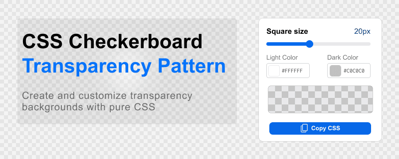
A checkerboard transparency pattern is a repeating square grid background that visually represents transparent areas in images or design layouts. Instead of a solid fill, alternating light and dark squares make empty or alpha regions easier to spot at a glance. This page also documents stripes, dots, grids, and other pure CSS repeating backgrounds you can build with the pattern generators on this page.
This pattern is widely used in:
- PNG image previews and export dialogs
- Image editing and photo retouching software
- Graphic design and layout applications
- Online image converters and upload widgets
- Background transparency indicators in web UIs
Jump to the CSS background pattern generator when you are ready to pick a style, customize size and colors, and copy the CSS output.
Checkerboard Pattern Generator
Use the controls below to adjust checkerboard square size and colors. The preview updates instantly, and the CSS output block below reflects your current settings. See the feature list for each control, and the how-to steps for the recommended workflow.
Live preview
Generated CSS
Copy this CSS and apply the generated class to any container. The class name changes with the selected pattern style (for example .checkerboard-bg or .stripes-bg). Choose whether the output uses CSS custom properties (easy to theme later) or literal color and size values (compact paste-ready CSS).
.checkerboard-bg {
	--cb-size: 15px;
	--cb-light: #ffffff;
	--cb-dark: #d7d7d7;

	background: conic-gradient(
		var(--cb-dark) 25%,
		var(--cb-light) 0 50%,
		var(--cb-dark) 0 75%,
		var(--cb-light) 0
	) 0 0 / var(--cb-size) var(--cb-size);
}<div class="checkerboard-bg" style="width: 100%;min-height: 300px;"></div>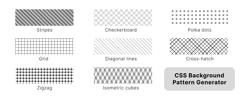
Stripes Pattern Generator
Build diagonal stripe backgrounds with repeating linear gradients. Set stripe colors and repeat size, then copy the CSS from the checkerboard pattern generator output block when you are ready to paste into your project.
.stripes-bg {
    --s-size: 20px;
    --s-light: #ffffff;
    --s-dark: #d7d7d7;

    background-image: repeating-linear-gradient(45deg, var(--s-dark) 0 calc(var(--s-size) / 2), var(--s-light) calc(var(--s-size) / 2) var(--s-size));
}<div class="stripes-bg" style="width: 100%;min-height: 300px;"></div>Polka Dots Pattern Generator
Create tiled polka dot backgrounds with radial gradients. Control background color, dot color, spacing, and dot size. Copy finished CSS from the checkerboard pattern generator output when you are done.
.dots-bg {
    --d-size: 20px;
    --d-radius: 3px;
    --d-color: #d7d7d7;

    background-image: radial-gradient(circle, var(--d-color) var(--d-radius), transparent var(--d-radius));
    background-size: var(--d-size) var(--d-size);
}<div class="dots-bg" style="width: 100%;min-height: 300px;"></div>Grid Pattern Generator
Generate graph-paper style grids with perpendicular line gradients. Set background and line colors, cell size, and line thickness. Use the shared output in the checkerboard pattern generator section to copy CSS.
.grid-bg {
    --g-size: 20px;
    --g-line: 1px;
    --g-color: #d7d7d7;

    background-image:
        linear-gradient(to right, var(--g-color) var(--g-line), transparent var(--g-line)),
        linear-gradient(to bottom, var(--g-color) var(--g-line), transparent var(--g-line));
    background-size: var(--g-size) var(--g-size);
}<div class="grid-bg" style="width: 100%;min-height: 300px;"></div>Diagonal Lines Pattern Generator
Thin diagonal lines on a solid background, built with a repeating linear gradient. Adjust colors, repeat spacing, and line thickness, then copy CSS from the checkerboard pattern generator output block.
.diagonal-lines-bg {
    --l-size: 20px;
    --l-line: 2px;
    --l-color: #d7d7d7;

    background-image: repeating-linear-gradient(45deg, var(--l-color) 0 var(--l-line), transparent var(--l-line) var(--l-size));
}<div class="diagonal-lines-bg" style="width: 100%;min-height: 300px;"></div>Cross-hatch Pattern Generator
Cross-hatch backgrounds combine two opposing diagonal repeating gradients. Pick background and hatch colors and set repeat spacing. Copy CSS from the checkerboard pattern generator output when finished.
.crosshatch-bg {
    --h-size: 20px;
    --h-color: #d7d7d7;

    background-image:
        repeating-linear-gradient(45deg, var(--h-color) 0 1px, transparent 1px var(--h-size)),
        repeating-linear-gradient(-45deg, var(--h-color) 0 1px, transparent 1px var(--h-size));
}<div class="crosshatch-bg" style="width: 100%;min-height: 300px;"></div>Zigzag Pattern Generator
Chevron and zigzag tiles from four angled linear gradients. Set background and chevron colors and tile size, then copy CSS from the checkerboard pattern generator shared output.
.zigzag-bg {
    --z-size: 20px;
    --z-color: #d7d7d7;

    background:
        linear-gradient(135deg, var(--z-color) 25%, transparent 25%) 0 0,
        linear-gradient(225deg, var(--z-color) 25%, transparent 25%) 0 0,
        linear-gradient(315deg, var(--z-color) 25%, transparent 25%),
        linear-gradient(45deg, var(--z-color) 25%, transparent 25%);
    background-size: var(--z-size) var(--z-size);
}<div class="zigzag-bg" style="width: 100%;min-height: 300px;"></div>Isometric Cubes Pattern Generator
Layered gradients form a 3D cube lattice. Set cube edge, mid-tone, and background colors plus cube size. Copy the generated CSS from the checkerboard pattern generator output block.
.iso-cubes-bg {
    --c-size: 20px;
    --c-dark: #cccccc;
    --c-mid: #969696;

    background:
        linear-gradient(30deg, var(--c-dark) 12%, transparent 12.5%, transparent 87%, var(--c-dark) 87.5%, var(--c-dark)),
        linear-gradient(150deg, var(--c-dark) 12%, transparent 12.5%, transparent 87%, var(--c-dark) 87.5%, var(--c-dark)),
        linear-gradient(30deg, var(--c-dark) 12%, transparent 12.5%, transparent 87%, var(--c-dark) 87.5%, var(--c-dark)),
        linear-gradient(150deg, var(--c-dark) 12%, transparent 12.5%, transparent 87%, var(--c-dark) 87.5%, var(--c-dark)),
        linear-gradient(60deg, var(--c-mid) 25%, transparent 25.5%, transparent 75%, var(--c-mid) 75%, var(--c-mid)),
        linear-gradient(60deg, var(--c-mid) 25%, transparent 25.5%, transparent 75%, var(--c-mid) 75%, var(--c-mid));
    background-size: var(--c-size) calc(var(--c-size) * 1.73);
    background-position:
        0 0,
        0 0,
        calc(var(--c-size) / 2) calc(var(--c-size) * 0.87),
        calc(var(--c-size) / 2) calc(var(--c-size) * 0.87),
        0 0,
        calc(var(--c-size) / 2) calc(var(--c-size) * 0.87);
}<div class="iso-cubes-bg" style="width: 100%;min-height: 300px;"></div>Features
The generator on this page covers multiple gradient-based patterns, live preview, color control, and copy-ready CSS. These are the main options while you build a repeating background.
- Pattern style menu: Dedicated generator sections for checkerboard, stripes, polka dots, grid, diagonal lines, cross-hatch, zigzag, and isometric cubes.
- Pure CSS patterns: Every style uses layered or repeating CSS gradients. No background image file is required.
- Pattern size slider: Set tile or cell size from 4px to 80px and see the preview update instantly.
- Light and accent colors: Pick both colors with color inputs. Values are written into CSS custom properties for the active pattern.
- Live preview: The preview panel reflects every control change without reloading the page.
- Sample overlay: Toggle a semi-transparent shape on the preview to mimic how PNG transparency looks on top of the checkerboard grid.
- CSS output format: Copy generated CSS with custom properties for theming, or literal values for a minimal snippet.
- Copy CSS output: Generated CSS matches your current settings and can be copied in one click.
- Responsive background: The pattern scales with the container and repeats automatically.
- Modern browser support: Works in current desktop and mobile browsers that support CSS gradients and custom properties.
How to Use This Tool
Follow these steps to create a CSS background pattern with the generator on this page.
- Open the pattern generator section you need (checkerboard, stripes, dots, grid, or another style below).
- Set the pattern size with the slider until the repeat matches the density you want.
- Choose light and accent colors that contrast enough for your UI or preview surface.
- Review the live preview and turn the sample overlay on or off when using the checkerboard style to check how transparent content will look.
- Copy the generated CSS from the output block. Switch output format to CSS variables or literal values depending on whether you plan to theme the pattern later.
- Paste the CSS into your stylesheet and add the generated class to the target container in HTML.
How the CSS Pattern Works
The checkerboard transparency effect uses a single conic-gradient with four 90-degree color stops. Alternating --cb-dark and --cb-light values paint each quadrant of the tile, and background-size sets how large each square cell repeats. Other pattern styles on this page use repeating-linear-gradient, radial-gradient, or multiple linear gradients with the same idea: short gradient declarations that tile through background-size and optional background-position.
The checkerboard tiles across the full container with two properties:
background-image: conic-gradient(
    var(--cb-dark) 90deg,
    var(--cb-light) 90deg 180deg,
    var(--cb-dark) 180deg 270deg,
    var(--cb-light) 270deg
);
background-size: var(--cb-size) var(--cb-size);
For live resizing, store tile dimensions in a CSS variable and update them with JavaScript. Each pattern generator on this page outputs the full rule set in the shared checkerboard pattern generator code block.
Use Cases
Checkerboard and other CSS background patterns appear in many product surfaces. These are common places to use the CSS from this tool.
- PNG transparency previews in upload and export dialogs
- Image upload drop zones that show alpha before save
- Background transparency indicators in admin panels
- Canvas and drawing application work areas
- Photo editing tool crop and mask previews
- Wireframe and graph-paper backgrounds in layout mockups
- Striped or dotted section backgrounds in marketing and app UI
- CSS pattern generators and design system playgrounds
- Graphic design software mockups and component libraries
Pair checkerboard CSS with an image converter or WebP tool when you also need to optimize exported assets. Use stripes, dots, or grid patterns for decorative sections. Related links are listed in the related tools section.
Frequently Asked Questions
Answers to common questions about checkerboard transparency backgrounds, pure CSS patterns, live resizing, custom colors, and browser support.
What is a checkerboard transparency background?
A checkerboard transparency background is a repeating square grid used to visually represent transparent areas in images and design applications.
Why do image editors use checkerboard patterns?
Image editors use checkerboard patterns because they make transparent regions easy to distinguish from white or solid backgrounds.
Can I create a checkerboard pattern using only CSS?
Yes. You can create a checkerboard transparency pattern with a single CSS conic-gradient and background-size, without using any image files.
How do I change checkerboard square size dynamically?
Update the --cb-size CSS variable (or the background-size value) with JavaScript for live resizing. The conic gradient scales with the tile size automatically.
Does this pattern work on mobile devices?
Yes. CSS checkerboard patterns work on all modern desktop and mobile browsers.
What other CSS background patterns does this tool support?
Besides the checkerboard transparency grid, you can generate or copy CSS for diagonal stripes, polka dots, graph paper grids, diagonal lines, cross-hatch, zigzag chevrons, and isometric cube patterns. Each uses gradients and CSS custom properties for size and colors.
Can I use custom colors for the light and dark squares?
Yes. Set --cb-light and --cb-dark CSS variables, or change the gradient color stops directly in the generated CSS.
Related Tools
Need image conversion, CSS effects, or other design utilities? These pages cover nearby workflows.
- Image to WebP converter when you want to optimize transparent PNG assets.
- Rainbow text generator for colorful CSS text effects and gradient headings.
- Country flag PNG download for sprite sheets and resized flag icons.
- Image tools hub for other image download and conversion pages.
- CSS tools hub for more CSS generators and pattern utilities.