Lightweight JavaScript Autocomplete Library
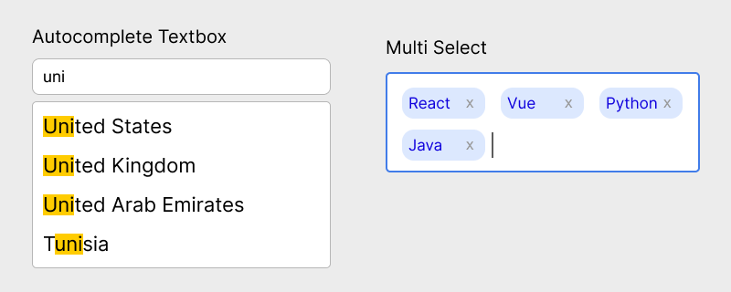
This lightweight JavaScript autocomplete library adds typeahead suggestions, async remote search, and multi-select chips to any text input in plain HTML and JavaScript. It is a zero-dependency combobox that supports local arrays, async fetch sources, free-text custom values, match highlighting, and keyboard navigation - without React, jQuery, or a heavy UI toolkit.
Table of Contents
What is hcg-autocomplete?
hcg-autocomplete is a free JavaScript typeahead library for <input type="text"> fields. You pass a source option: either a string array for client-side filtering, or a function that loads matches from your own API. As the user types, a dropdown lists suggestions with highlighted matches, arrow-key navigation, and proper combobox ARIA roles (role="combobox", aria-activedescendant).
Unlike a searchable <select>, suggestions are not fixed in the HTML. You can swap the source array at runtime with setSource(), load results after a debounced fetch, allow values that are not in the list (allowCustom), or collect several choices as removable chips when multiple is enabled. The original input stays in the DOM for labels, validation, and form posts.
Why use hcg-autocomplete?
Native <datalist> cannot style the dropdown, debounce API calls, show a loading state, or build a tag picker. Framework autocomplete widgets often add a large bundle for one search field on an otherwise static page. This library fits dynamic suggestion lists from local arrays or your own API, with chips, custom values, and no extra dependencies. See the comparison or the feature list.
Live Demo
Try the widgets below. Type to filter local cities, pick multiple skills as chips, or search frameworks with a simulated async source. For every option on one page, open the hcg-autocomplete demo page.
Comparison Table
How hcg-autocomplete compares with common alternatives.
| Feature | hcg-autocomplete | hcg-select | Native datalist | Heavy UI libs |
|---|---|---|---|---|
| Target element | Text input | Native select | Text input | Varies |
| Dependencies | None | None | None | Often jQuery or a framework |
| Dynamic / async source | Yes | No (fixed options) | Limited | Yes |
| Multi-select chips | Yes | No | No | Yes |
| Free-text custom values | Yes (allowCustom) | No | Yes | Varies |
| Match highlighting | Yes | Yes | No | Yes |
| Keyboard navigation | Yes | Yes | Browser-dependent | Yes |
| Form submission | Yes | Yes (native select) | Yes | Varies |
| Approximate size | One small JS file plus CSS | One small JS file plus CSS | n/a | Large |
| License / cost | Free, MIT | Free, MIT | n/a | Varies |
Choose hcg-autocomplete when you need typeahead on a text input with local or remote data, optional tags, and free-text entry. Use hcg-select when you already have a <select> with fixed options. Use a heavier library when you need virtualized lists, complex templating, or framework-specific components.
Features
Everything included in the library at a glance:
- Zero dependencies - one small JavaScript file and a companion CSS file.
- Script tag or bundler - works with a plain script tag, CommonJS, or AMD.
- Local array source - filter strings or
{ value, label }objects as the user types. - Async remote source - pass a function that receives the query and a
donecallback. - Built-in debounce - configurable delay before async or local filtering runs.
- Multi-select chips - removable tags with
multiple: trueand optionalmaxItems. - Free-text values -
allowCustomlets users commit text not in the list. - Match highlighting - query text is highlighted in suggestion labels.
- Keyboard navigation - arrow keys, Enter, Escape, and Backspace for chips.
- Clearable - optional clear button on single-select inputs.
- Form-friendly - single mode keeps the input name; multiple mode adds a hidden field.
- Callbacks -
onInput,onOpen,onClose,onSelect,onRemove, andonChange. - Static helpers -
get(),destroy(), anddestroyAll(). - Multiple instances - independent comboboxes on the same page.
- React-friendly - create in
useEffectand calldestroy()on unmount.
Installation
Basic Usage
Install hcg-autocomplete, add a text input to your markup, then call hcgAutocomplete() with a source array.
Async Remote Source
Pass a function as source to load suggestions from an API. The function receives the query string and a done callback. Debounce is built in via the debounce option. Only the latest request is applied when responses arrive out of order.
The example below uses the free DummyJSON products API so you can try it in the browser without your own backend.
<label for="search">Product</label>
<input id="search" type="text" placeholder="Search products..." autocomplete="off">
hcgAutocomplete('#search', {
  minChars: 2,
  debounce: 300,
  source: (query, done) => {
    fetch('https://dummyjson.com/products/search?q=' + encodeURIComponent(query))
      .then((response) => response.json())
      .then((data) => {
        const lowerQuery = query.toLowerCase();
        done(null, data.products
          .filter((item) => item.title.toLowerCase().includes(lowerQuery))
          .map((item) => ({
            value: item.id,
            label: item.title
          })));
      })
      .catch((error) => done(error));
  }
}); While the request is in flight the panel shows the loadingText message. On error the panel shows the noResultsText message.
Multi-select Chips
Set multiple: true to let users pick several items. Selected values appear as removable chips above the input. Press Backspace on an empty input to remove the last chip. Use maxItems to cap how many can be selected.
<label for="skills">Skills</label>
<input id="skills" type="text" placeholder="Add skills..." autocomplete="off">hcgAutocomplete('#skills', {
multiple: true,
maxItems: 5,
source: ['HTML', 'CSS', 'JavaScript', 'TypeScript', 'React', 'Vue'],
onChange: (input, values) => {
console.log('Selected:', values);
},
onRemove: (input, item) => {
console.log('Removed:', item.label);
}
});In multiple mode a hidden input receives comma-separated values for form submission. The visible text input is used only for typing new queries.
HTML Forms and required Validation
hcg-autocomplete does not add or remove the native required attribute. The browser runs standard HTML5 validation on the visible text input. How that behaves depends on single-select vs multiple mode and whether you need a committed selection or only non-empty text.
| Mode | required on input | Recommended check |
|---|---|---|
| Single-select | Works for non-empty text | Use getValue() if a list selection is required |
| Multiple | Do not use on the search input | Use getValue().length on submit and clear setCustomValidity() in onChange |
Multiple Instances
Create as many autocomplete inputs on a page as you need. Each call to hcgAutocomplete() returns a fully independent instance with its own source, value, options, and API.
<input id="city" type="text" placeholder="City" autocomplete="off">
<br>
<input id="country" type="text" placeholder="Country" autocomplete="off">const cityAc = hcgAutocomplete('#city', {
source: ['London', 'Paris', 'Berlin']
});
const countryAc = hcgAutocomplete('#country', {
source: ['United Kingdom', 'France', 'Germany']
});
cityAc.setValue('London');
// countryAc.open();- Link
hcg-autocomplete.cssonce and initialize as many inputs as you need. - Static helpers accept a selector:
hcgAutocomplete.get('#city'). - Call each instance's
destroy()when removing it from the DOM.
Options Reference
Pass these as the second argument to hcgAutocomplete(input, options). Options can be changed at runtime with setOption(name, value).
| Option | Type | Default | Description |
|---|---|---|---|
| source | array | function | [] | Local array of strings or objects, or async function (query, done). |
| minChars | number | 1 | Minimum characters before suggestions appear. |
| debounce | number | 300 | Milliseconds to wait after typing before filtering or calling async source. |
| multiple | boolean | false | Enable multi-select with removable chips. |
| allowCustom | boolean | false | Allow Enter to commit text not in the suggestion list. |
| clearable | boolean | true | Show clear button on single-select inputs. |
| highlight | boolean | true | Highlight matching query text in labels. |
| maxItems | number | null | null | Maximum selections in multiple mode. null means no limit. |
| valueKey | string | 'value' | Property name for submitted value on object items. |
| labelKey | string | 'label' | Property name for displayed label on object items. |
| noResultsText | string | 'No results' | Message when no suggestions match. |
| loadingText | string | 'Loading...' | Message while async source is loading. |
| commitOnBlur | boolean | false | Commit typed text on blur when allowCustom is true. |
| onInput | function | - | Called on input. Receives (input, query, api). |
| onOpen | function | - | Called when panel opens. Receives (input, api). |
| onClose | function | - | Called when panel closes. Receives (input, api). |
| onSelect | function | - | Called when an item is selected. Receives (input, item, api). |
| onRemove | function | - | Called when a chip is removed. Receives (input, item, api). |
| onChange | function | - | Called when value changes. Receives (input, value, api). |
Options
Copy-paste examples for each option. See Options Reference above for types and default values.
API Reference
hcgAutocomplete(input, options) returns an instance with these methods. The factory also exposes hcgAutocomplete.version, get(), destroy(), and destroyAll().
| Method / Property | Returns | Description |
|---|---|---|
| open() | instance | Open the suggestion panel. |
| close() | instance | Close the suggestion panel. |
| clear() | instance | Clear the current value and input text. |
| getValue() | string | array | Current value. Array in multiple mode. |
| setValue(value, silent?) | instance | Set value programmatically. Pass true as the second argument to skip onChange and native events. |
| setSource(source) | instance | Replace the suggestion source. |
| getSource() | array | function | Current source option. |
| refresh() | instance | Re-run source query with current input text. |
| setOption(name, value) | instance | Update any option at runtime. |
| enable() | instance | Enable the input. |
| disable() | instance | Disable the input and close the panel. |
| destroy() | instance | Remove listeners, unwrap DOM, and delete the instance. |
| element | Element | The wrapper .hcg-autocomplete element. |
| input | Element | The original text input element. |
| hcgAutocomplete.get(target) | instance | null | Static helper to retrieve an instance by element or selector. |
| hcgAutocomplete.destroy(target) | boolean | Static helper to destroy an instance. |
| hcgAutocomplete.destroyAll() | void | Destroy every instance on the page. |
| hcgAutocomplete.version | string | Library version string (currently '1.0.0'). |
Callbacks
The library reports input, panel, selection, and value changes through callback options. Pass them when you create the instance, or update them later with setOption().
Using with React
Import hcgAutocomplete from the package and create the combobox inside useEffect. Call destroy() in the cleanup function when the component unmounts.
Try the live React demo on StackBlitz
Load hcg-autocomplete.css once in your app entry or import it in the component. Use disable() and enable() from props or effects when you need to lock the field during async work.
Styling and Customization
All default styles live in hcg-autocomplete.css, using CSS custom properties and plain class selectors. Edit that file directly, or override any rule from your own stylesheet loaded after it.
.hcg-autocomplete- root wrapper with CSS variables for colors, radius, and font size.hcg-autocomplete-input- the text input inside the control.hcg-autocomplete-panel- the dropdown suggestion panel.hcg-autocomplete-list/.hcg-autocomplete-option- suggestion items.hcg-autocomplete-chips/.hcg-autocomplete-chip- multi-select tags.hcg-autocomplete-clear- the clear button on single-select inputs.is-open/.is-multiple/.is-disabled- state classes on the wrapper
.hcg-autocomplete {
  --hcg-ac-border-focus: #7c3aed;
  --hcg-ac-hover: #f5f3ff;
  --hcg-ac-mark: #c4b5fd;
  --hcg-ac-radius: 10px;
}

.hcg-autocomplete-option.is-active {
  background: #ede9fe;
  color: #5b21b6;
}
Browser Support
hcg-autocomplete works in modern browsers that support ES5, DOM APIs, and ARIA attributes on combobox inputs.
| Browser | Supported |
|---|---|
| Google Chrome | Yes |
| Mozilla Firefox | Yes |
| Microsoft Edge | Yes |
| Safari / iOS Safari | Yes |
| Mobile browsers | Yes |
License
Released under the MIT License. Free for personal and commercial use. Copyright HTML Code Generator.
Frequently asked questions
What is the difference between hcg-autocomplete and hcg-select?
hcg-select enhances a native select element with search and keyboard navigation over fixed options. hcg-autocomplete enhances a text input with dynamic suggestions from a local array or async function, optional multi-select chips, and free-text custom values.
How do I load suggestions from an API?
Pass a function as the source option. The function receives the query string and a done callback. Call done(null, items) with the result array, or done(error) on failure. Debounce is built in via the debounce option.
Can users enter values not in the suggestion list?
Yes. Set allowCustom to true. Users can press Enter to commit the typed text as a value even when it does not match any suggestion.
Does hcg-autocomplete work in HTML forms?
Yes. In single-select mode the native input keeps its name and submits the selected label. In multiple mode a hidden input receives comma-separated values for form submission.
How does the required attribute work with hcg-autocomplete?
The library leaves the native required attribute on your input. In single-select mode the browser checks that the visible input is not empty. That does not guarantee the user picked from the list; use getValue() with setCustomValidity() on submit when a real selection is required. In multiple mode required on the search input is unreliable because the field is often empty after chips are added; validate getValue().length instead.
How do I enable multi-select chips?
Set multiple to true in the options object when you call hcgAutocomplete(). Selected items appear as removable chips. Use maxItems to limit how many can be selected.
Does hcg-autocomplete have any dependencies?
No. hcg-autocomplete is plain vanilla JavaScript with zero dependencies. Include hcg-autocomplete.js and hcg-autocomplete.css and you are ready to go.