Google Chrome DevTools Style Color Picker - JavaScript Library
Create modern color selection interfaces with this lightweight JavaScript color picker inspired by the Google Chrome color picker UI. The library supports HEX, RGBA, HSLA, and alpha transparency color formats for flexible color selection and conversion.
Built-in EyeDropper API support allows users to pick colors directly from anywhere on the screen in supported browsers. The color picker is fully touch-friendly, keyboard accessible, and optimized for both desktop and mobile devices.
Multiple independent picker instances can share a single reusable UI component, helping reduce memory usage and improve performance. Advanced features include live color preview, event listeners, programmatic API methods, and runtime control for opening, closing, enabling, disabling, and updating colors dynamically.
Table of Contents
What is hcg-color-picker?
hcg-color-picker is a free, open-source JavaScript color picker widget that replicates the built-in color picker from Google Chrome. It is dependency-free, supports multiple instances on the same page, and works with plain HTML, React, Vue, Svelte, and any modern JavaScript framework. It outputs colors in HEX, RGBA, and HSLA formats and includes an alpha (opacity) slider and EyeDropper API support.
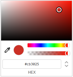
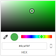
Color Picker Preview
Why use hcg-color-picker?
Native <input type="color"> controls look different in every browser and offer limited formatting. Full design-system color pickers often bundle palettes, gradients, and presets you may not need. hcg-color-picker focuses on one job: a familiar Chrome-style picker that is small, dependency-free, and easy to wire to any trigger button.
- Consistent cross-browser UI - the same panel everywhere, unlike native color inputs that vary by browser and OS.
- Works with your existing buttons - drop it onto theme editors, CMS fields, admin settings, or form controls without redesigning the page.
- No framework or build step - two static files and
new hcgColor(); no React, jQuery, or bundler required. - Lightweight on busy pages - many triggers can share one floating popup instead of mounting a full picker UI per button.
- Ready for live previews - debounced callbacks and
setColor()/getColor()make it practical for real-time style or theme updates. - Outputs formats your app already uses - hex, rgba, and hsla strings are returned from one callback, so you can store or apply colors without manual conversion.
Live Demo
Explore interactive color picker demos including default mode, alpha-disabled mode, and disabled state examples. Click any color button to open the picker and preview color selection in real time. color picker demo page
Default:
No alpha:
Disabled:
Features
Lightweight Chrome-style color picker with HEX, RGBA, HSLA, alpha control, EyeDropper API support, touch support, and multiple instances.
- Lightweight & dependency free - Built using pure vanilla JavaScript with no external libraries or frameworks required.
- Chrome-inspired UI - Modern popup design similar to the built-in Google Chrome color picker experience, with a saturation/brightness box, hue slider, preview swatch, and an input-mode toggle to cycle HEX → RGB → HSL.
- Alpha transparency control - Enable or disable opacity selection with a built-in alpha slider and checkerboard-backed preview.
- Multiple picker instances - Attach independent color pickers to multiple buttons or elements while sharing a single optimized UI component. Only one panel is open at a time.
- EyeDropper API support - Pick colors directly from anywhere on the screen in supported browsers (Chrome and Edge).
- Mobile & touch friendly - Works smoothly on mobile phones, tablets, and touch-enabled devices. Sliders use
touch-action: nonefor reliable drag interaction. - Debounce support - Built-in change-event throttling - delay callbacks until the user stops dragging to avoid expensive operations on every frame.
- Event system - Subscribe and unsubscribe to
change,open, andcloseevents using.on()and.off(), or passonChange,onOpen, andonClosein the constructor. - Multiple color formats - Output and accept colors in all common string formats:
- HEX
- HEXA
- RGB
- RGBA
- HSL
- HSLA
- Programmatic API - Control the picker using JavaScript methods:
setColor()getColor()open()close()enable()disable()destroy()
- Copy to clipboard - Hover the preview circle inside the panel to copy the current color value.
- Smart positioning - The popup repositions on scroll and resize, and auto-flips above the trigger when there is not enough room below the viewport.
- Outside click to close - Click anywhere outside the panel to dismiss it; pending debounced changes flush on close.
Installation
Basic Usage
Create a new picker instance and attach it to a button or HTML element using pure vanilla JavaScript.
<button id="color-btn">Pick Color</button>const picker = new hcgColor(
document.getElementById('color-btn'),
{ color: '#ff0000' }
);
picker.on('change', function (colors, source) {
console.log(colors.hex); // "#ff0000"
console.log(colors.rgba); // "rgba(255, 0, 0, 1)"
console.log(colors.hsla); // "hsla(0, 100%, 50%, 1)"
console.log(source); // "drag" | "input" | "api" | "eyedropper"
});Options
Pass an options object as the second argument to the constructor:
const picker = new hcgColor(element, {
    color:    '#ff0000',
    onChange: colors => console.log(colors.hex),
    onOpen:   hex => console.log('opened', hex),
    onClose:  hex => console.log('closed', hex),
    alpha:    true,
    debounce: 150,
    disabled: false,
});| Option | Type | Default | Description |
|---|---|---|---|
color | string | data-color or #ff0000 | Initial color - accepts HEX, RGB, HSL formats |
onChange | function | - | Shorthand change callback, same as .on('change') |
onOpen | function | - | Shorthand open callback, same as .on('open') |
onClose | function | - | Shorthand close callback, same as .on('close') |
alpha | boolean | true | Set to false to disable the alpha slider |
debounce | number | 0 | ms to debounce the change event during drag (0=off) |
disabled | boolean | false | Start in disabled state - also reads the element's disabled attribute |
Color Format Examples
new hcgColor(element, { color: '#ff0000' });                // 6-digit HEX
new hcgColor(element, { color: '#ff0000ff' });              // 8-digit HEX with alpha
new hcgColor(element, { color: '#f00' });                   // 3-digit shorthand
new hcgColor(element, { color: 'rgb(255, 0, 0)' });         // RGB
new hcgColor(element, { color: 'rgba(255, 0, 0, 0.5)' });   // RGBA
new hcgColor(element, { color: 'hsl(0, 100%, 50%)' });      // HSL
new hcgColor(element, { color: 'hsla(0, 100%, 50%, 1)' });  // HSLA
Using Debounce
By default the change event fires on every pointer move during drag, up to 60 times per second. The debounce option delays the event until the user pauses or stops dragging, which is useful for expensive operations like API calls, saving to a database, or heavy re-renders.
const picker = new hcgColor(btn, {
    color:    '#ff0000',
    debounce: 200,
    onChange: (colors) => {
        console.log(colors.hex); // fires 200ms after drag stops
    }
});
Without debounce the change event fires continuously during drag. With debounce: 200 the event waits 200ms after the last movement before firing. Set to 0 to disable debouncing entirely.
Live comparison, drag the sliders and watch the counters:
No Debounce debounce: 0:
With Debounce debounce: 200:
Instance Methods
All Methods at a Glance
| Method | Returns | Description |
|---|---|---|
.on(event, fn) | this | Subscribe to an event |
.off(event, fn) | this | Unsubscribe a listener |
.setColor(color) | this | Set the color programmatically, fires change |
.getColor() | object | Returns color object with all formats |
.setAlphaEnabled(bool) | this | Show or hide the alpha slider at runtime |
.open() | this | Open the picker (no effect if disabled) |
.close() | this | Close the picker |
.isOpen | boolean | Getter - true if this picker is currently open |
.enable() | this | Re-enable a disabled picker |
.disable() | this | Disable the picker - blocks opening on click |
.destroy() | void | Remove instance, clean up all listeners |
Events and callbacks
Subscribe to events with .on() and unsubscribe with .off().
| Event | Callback data | Description |
|---|---|---|
change | (colors, source) | Fired every time the color changes |
open | hex string | Fired when the picker opens |
close | hex string | Fired when the picker closes |
change Fires on every color update - includes all formats
picker.on('change', (colors, source) => {
    console.log(colors.hex);   // "#ff0000"
    console.log(colors.hexa);  // "#ff0000ff"
    console.log(colors.rgb);   // "rgb(255, 0, 0)"
    console.log(colors.rgba);  // "rgba(255, 0, 0, 1)"
    console.log(colors.hsl);   // "hsl(0, 100%, 50%)"
    console.log(colors.hsla);  // "hsla(0, 100%, 50%, 1)"

    console.log(source);      // "drag" | "input" | "api" | "eyedropper"
});
open Fires when the picker opens - receives current hex color
picker.on('open', hex => console.log('Opened with:', hex));close Fires when the picker closes - receives final hex color
picker.on('close', hex => console.log('Closed with:', hex));Output Color Formats
The colors object returned by onChange and .getColor():
{
    hex:  "#ff0000",       // 6-digit HEX - no alpha
    hexa: "#ff0000ff",     // 8-digit HEX - with alpha
    rgb:  "rgb(255, 0, 0)",
    rgba: "rgba(255, 0, 0, 1)",
    hsl:  "hsl(0, 100%, 50%)",
    hsla: "hsla(0, 100%, 50%, 1)"
}
Multiple Instances
Each instance is fully independent - they share one picker UI but each stores its own color state.
const picker1 = new hcgColor(document.getElementById('btn1'), { color: '#f44336' });
const picker2 = new hcgColor(document.getElementById('btn2'), { color: '#2196f3' });
const picker3 = new hcgColor(document.getElementById('btn3'), { color: '#4caf50', alpha: false });

picker1.on('change', colors => console.log('Picker 1:', colors.hex));
picker2.on('change', colors => console.log('Picker 2:', colors.hex));
React Package
A dedicated React component is available as a separate package for React projects. The component supports all the same options as the vanilla JavaScript version including alpha control, debounce, disabled state, and programmatic API via ref.
Install:
npm install hcg-color-picker-reactImport:
import ColorPicker from 'hcg-color-picker-react';
import 'hcg-color-picker-react/ColorPicker.css';
Basic usage:
function App() {
    function handleChange(colors, source) {
        console.log(colors.hex);   // "#ff0000"
        console.log(colors.rgba);  // "rgba(255, 0, 0, 1)"
        console.log(source);       // "drag" | "input" | "api" | "eyedropper"
    }

    return (
        <div>
            {/* Basic */}
            <ColorPicker color="#ff0000" onChange={handleChange} />

            {/* No alpha */}
            <ColorPicker color="#0000ff" alpha={false} onChange={handleChange} />

            {/* Debounced */}
            <ColorPicker color="#9c27b0" debounce={200} onChange={handleChange} />

            {/* Disabled */}
            <ColorPicker color="#00ff00" disabled={true} />
        </div>
    );
}
Full documentation and examples: hcg-color-picker-react on npm
Open in StackBlitzTroubleshooting
The picker does not open when I click the button.
Make sure the trigger element is a valid HTMLElement and that the script has fully loaded before calling new hcgColor(). Wrap initialization in a DOMContentLoaded listener or place the script at the bottom of <body>. Also check that the element does not have the disabled attribute or disabled: true in the options.
Colors look wrong or the picker opens with the wrong color.
The color option accepts HEX (#fff, #ffffff, #ffffff80), rgb(), rgba(), hsl(), and hsla(). Passing an invalid format falls back to #ff0000. Use picker.getColor().hex to verify the active color at runtime.
onChange fires too many times during drag.
Use the debounce option to throttle how often the callback fires. For example, { debounce: 150 } waits 150ms after the user stops dragging before firing.
The picker appears behind other elements or is cut off.
The picker is appended directly to document.body with a high z-index. If it is still hidden, check for a parent element with overflow: hidden, transform, or isolation: isolate which creates a new stacking context.
TypeScript error: "Could not find declaration file for module".
Both packages ship with bundled .d.ts files. Make sure you are using version 2 or later. If the error persists, check that your tsconfig.json includes "moduleResolution": "node" or "bundler".
EyeDropper button is not visible.
The EyeDropper API is only supported in Chrome 95+ and Edge 95+. It is not available in Firefox or Safari. The button is automatically hidden in unsupported browsers - this is expected behaviour.
What is new in v2
Version 2 is a full rewrite. The biggest changes from v1:
- Rewritten core - smaller bundle, faster initialisation
- Full TypeScript definitions bundled (
.d.ts) - EyeDropper API integration for screen color sampling
- React package (
hcg-color-picker-react) added - Debounce option to control onChange call frequency
- Improved touch and mobile support
- Multiple instances now share a single UI element
Common use cases
Here are real-world scenarios where hcg-color-picker is a drop-in solution.
Design tools & canvas editors
Attach a picker to any stroke, fill, or background control. Each instance remembers its own color independently.
Form builders
Add a color field to any form. Read the value anytime via element.dataset.color - no instance reference needed.
Theme & brand customisers
Update CSS custom properties in real time from onChange for instant live theme previews.
Image & photo editors
Use the built-in EyeDropper API to sample any color directly from the screen.
Chart & data visualisation
Let users recolor data series. Use debounce to avoid expensive re-renders on every drag tick.
Settings & preferences panels
Use onClose to persist only the final color value, not every intermediate drag position.
Why use this instead of <input type="color">?
The native color input is fine for quick prototypes, but it has serious gaps for real products. Here is how they compare.
| Feature | Native <input type="color"> | hcg-color-picker |
|---|---|---|
| Alpha / opacity control | ✗ Not supported | ✓ Built-in alpha slider |
| Color output formats | HEX only | HEX, HEXA, RGB, RGBA, HSL, HSLA |
| Consistent UI across browsers | ✗ Varies per OS & browser | ✓ Identical on all browsers |
| Styleable trigger button | ✗ Browser-controlled appearance | ✓ Fully styleable via CSS |
| EyeDropper (screen color sampler) | ✗ Not available | ✓ Built-in (Chrome / Edge) |
| Programmatic API | ✗ No open / close / setColor | ✓ open, close, setColor, getColor… |
| Change event debounce | ✗ Not available | ✓ Built-in debounce option |
| Multiple instances on one page | △ Works but no shared state | ✓ Each instance fully independent |
| Smart viewport positioning | ✗ OS popup, uncontrolled | ✓ Flips above / below automatically |
| React component | ✗ None | ✓ Dedicated React package |
| TypeScript support | △ Basic via lib.dom.d.ts | ✓ Bundled .d.ts declarations |
| Dependencies | None (native) | None (vanilla JS) |
Use the native input when you need a zero-JS, one-line solution and alpha / consistent UI do not matter. Use hcg-color-picker when you need alpha support, reliable cross-browser appearance, RGBA / HSLA output, or a React component.
Browser Support
| Feature | Support |
|---|---|
| Color picker UI | All modern browsers |
| Touch events | iOS Safari, Android Chrome |
| EyeDropper API | Chrome 95+, Edge 95+ (not Firefox / Safari) |
Frequently Asked Questions (FAQ)
What is hcg-color-picker?
hcg-color-picker is a lightweight Chrome DevTools-style JavaScript color picker library built with pure vanilla JavaScript and no external dependencies.
How do I add a Chrome-style color picker to my website using JavaScript?
You can add hcg-color-picker to your website using JavaScript by importing the library and attaching the color picker to an input or container element.
Which color formats does hcg-color-picker support?
hcg-color-picker supports HEX, HEXA, RGB, RGBA, HSL, HSLA, and HSV color formats.
Does hcg-color-picker support alpha transparency?
Yes. hcg-color-picker includes an alpha transparency slider for opacity and RGBA color control.
Can I disable the alpha slider in hcg-color-picker?
Yes. The alpha transparency slider can be enabled or disabled for each color picker instance.
Does hcg-color-picker require jQuery or other dependencies?
No. hcg-color-picker is built using pure vanilla JavaScript and does not require jQuery or any external libraries.
Does hcg-color-picker support multiple color picker instances?
Yes. Multiple independent hcg-color-picker instances can be attached to different elements while sharing a single optimized picker UI.
Is hcg-color-picker mobile friendly?
Yes. hcg-color-picker supports touch interactions and mobile dragging on smartphones and tablets.
Does hcg-color-picker support the EyeDropper API?
Yes. hcg-color-picker supports the EyeDropper API in compatible Chromium-based browsers such as Google Chrome and Microsoft Edge.
Can I programmatically control hcg-color-picker?
Yes. hcg-color-picker includes API methods such as setColor(), getColor(), open(), close(), enable(), disable(), and destroy().
Is there a React version of hcg-color-picker?
Yes. A separate React component package called hcg-color-picker-react is available for React applications.
Is hcg-color-picker free for commercial use?
Yes. hcg-color-picker is free to use in personal and commercial projects.
Who makes hcg-color-picker?
hcg-color-picker is developed by HTML Code Generator.
Related
Related links