Facebook-Style JavaScript Tooltip Library
Show polished dark tooltips on any element without jQuery or a heavy UI framework. hcg-tooltip is a zero-dependency vanilla JavaScript library inspired by jQuery Tipsy the Facebook-style tooltips used by Twitter, GitHub, and Bitbucket.
Table of Contents
What is hcg-tooltip?
A small API that turns any element into a styled tooltip target. Call hcgTooltip('.has-tip') with a selector or node; text is read from title, another attribute, or a callback. Gravity places the bubble on any of eight sides. For markup-only setup, add data-hcg-tooltip and call hcgTooltip.initFromData() once - details in Basic usage below.
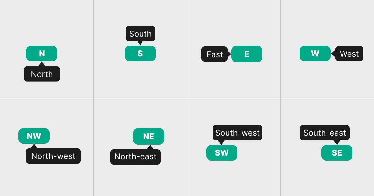
n, s, e, w, nw, ne, sw, se. Why use hcg-tooltip?
Native title tooltips look different in every browser, cannot be styled, and offer no control over position or timing. jQuery Tipsy solved that with a consistent dark bubble and directional arrows, but it depends on jQuery - an awkward fit for modern bundles, SPAs, and framework components that no longer ship it.
hcg-tooltip fills that gap: Tipsy-compatible option names and defaults, with no dependencies beyond two small files. It suits new vanilla projects, React or Vue apps that need a lightweight hint layer, and straightforward Tipsy migrations. See the comparison table for how it differs from Tipsy and native tooltips, and Features for the full capability list.
Demo
Hover or focus the elements below. For every demo in one place, open the full interactive demo page.
Comparison Table
How hcg-tooltip compares with common alternatives.
| Feature | hcg-tooltip | jQuery Tipsy | Native title | CSS-only [title] |
|---|---|---|---|---|
| Dependencies | None | jQuery | None | None |
| Styled appearance | Yes | Yes | Browser default | Limited |
| Gravity positioning | 8 directions | 8 directions | No | No |
| Fade on open | CSS (always) | Option | No | No |
| Show/hide delays | Yes | Yes | No | No |
| HTML content | Yes | Yes | No | No |
| Focus trigger | Yes | Yes | Partial | No |
| Manual control | Yes | Yes | No | No |
| Live delegation | Yes | Yes | No | No |
| Data attributes (no per-element JS) | Yes - 10 options via data-hcg-tooltip-* | No | No | No |
| File size | ~10 KB | Small + jQuery | n/a | n/a |
Installation
Basic Usage
Add a title attribute and initialize:
<a href="#" title="Helpful hint" class="has-tip">Hover me</a>hcgTooltip('.has-tip');The library copies title to data-original-title and removes the native attribute so the browser tooltip does not appear.
Features
Everything included in the library at a glance:
- Gravity positioning - eight compass directions plus dynamic function.
- CSS fade-in - smooth opacity transition when the tooltip opens.
- Custom class -
classNamefor error, success, or other themed variants. - Delays - configurable
delayInanddelayOut. - HTML content - rich markup inside the tooltip bubble.
- Triggers - hover, focus, or manual programmatic control.
- Live delegation - works on elements added after page load.
- Data attributes (no per-element JS) -
data-hcg-tooltipplus nine option attributes; oneinitFromData()call wires every matching element. - Custom title - any attribute name or callback function.
- Fallback text - default message when title is empty.
- Offset - pixel gap between target and tooltip.
- Opacity - control tooltip transparency.
- Instance API - show, hide, enable, disable, destroy.
- CSS variables - theme without editing the library.
Gravity (Positioning)
Control where the tooltip appears relative to the target element:
| Value | Position |
|---|---|
n | Below element, arrow points up (default) |
s | Above element, arrow points down |
e | Left of element, arrow points right |
w | Right of element, arrow points left |
nw | Below, arrow near left edge |
ne | Below, arrow near right edge |
sw | Above, arrow near left edge |
se | Above, arrow near right edge |
hcgTooltip('.tip', { gravity: 's' });  // show above

// Dynamic gravity based on viewport position
hcgTooltip('.smart-tip', {
  gravity: function (el) {
    var rect = el.getBoundingClientRect();
    return rect.top < window.innerHeight / 2 ? 's' : 'n';
  }
});
Triggers
| trigger | Events | Use case |
|---|---|---|
hover | mouseenter / mouseleave | Default - links, buttons, icons |
focus | focus / blur | Form inputs, keyboard accessibility |
manual | none (programmatic) | Custom show/hide logic |
// Focus trigger for inputs
hcgTooltip('input.help', { trigger: 'focus', gravity: 's' });

// Manual control
hcgTooltip('#target', { trigger: 'manual', gravity: 'n' });
hcgTooltip('#target', 'show');
hcgTooltip('#target', 'hide');
Live Delegation
For elements inserted after page load (AJAX, SPA renders, infinite scroll), use live: true with a CSS selector. One delegated listener handles all current and future matching elements.
hcgTooltip('.dynamic-tip', { live: true, gravity: 'n' });

// Later, append new elements - no re-init needed
var btn = document.createElement('button');
btn.className = 'dynamic-tip';
btn.title = 'I was added dynamically';
document.body.appendChild(btn);
live requires a selector string, not a DOM node.
Options Reference
| Option | Type | Default | Data attribute | Description |
|---|---|---|---|---|
className | string | function | null | data-hcg-tooltip-class | Extra CSS class(es) added to the tooltip root |
delayIn | number | 0 | data-hcg-tooltip-delay-in | Milliseconds before showing |
delayOut | number | 0 | data-hcg-tooltip-delay-out | Milliseconds before hiding |
fallback | string | '' | data-hcg-tooltip-fallback | Text when title resolves empty |
gravity | string | function | 'n' | data-hcg-tooltip-gravity | Position: n, s, e, w, nw, ne, sw, se |
html | boolean | false | data-hcg-tooltip-html | Render title as HTML |
live | boolean | false | - | Event delegation for dynamic elements (JS only) |
offset | number | 0 | data-hcg-tooltip-offset | Pixel gap from target element |
opacity | number | 0.8 | data-hcg-tooltip-opacity | Tooltip opacity (0-1) |
title | string | function | 'title' | data-hcg-tooltip or title | Attribute name or (el)=> string callback |
trigger | string | 'hover' | data-hcg-tooltip-trigger | hover | focus | manual |
Options marked with a data attribute can be set in HTML - add data-hcg-tooltip and call hcgTooltip.initFromData() once. The Basic usage section above covers every supported attribute.
Instance Methods
| Method | Description |
|---|---|
show() | Display the tooltip immediately |
hide() | Hide and remove the tooltip |
enable() | Re-enable tooltips on this element |
disable() | Suppress tooltips without removing listeners |
toggleEnabled() | Flip the enabled state |
destroy() | Remove listeners, hide tip, and clean up |
var tip = hcgTooltip.get(element);  // or hcgTooltip(element, true)
tip.show();
tip.hide();
tip.destroy();

// String dispatch
hcgTooltip(element, 'show');
hcgTooltip(element, 'hide');

// Global helpers
hcgTooltip.defaults;       // mutable default options
hcgTooltip.initFromData(); // init every [data-hcg-tooltip] element
hcgTooltip.revalidate();   // remove orphaned tips from DOM
hcgTooltip.destroyAll();   // tear down all instances and live delegates
Using with React
hcg-tooltip is framework-agnostic. In React, import hcg-tooltip.js and hcg-tooltip.css, attach the tooltip to a DOM ref inside useEffect, and call instance.destroy() when the component unmounts. No separate React package is required.
import { useEffect, useRef } from "react";
import hcgTooltip from "./hcg-tooltip.js";
import "./hcg-tooltip.css";

function HelpButton() {
  const ref = useRef(null);

  useEffect(() => {
    const el = ref.current;
    if (!el) return;
    const instance = hcgTooltip(el, { gravity: "n" });
    return () => instance.destroy();
  }, []);

  return (
    <button type="button" ref={ref} title="Saved to your account!">
      Hover me
    </button>
  );
}
Text comes from the element's title attribute (moved to data-original-title automatically), or pass a function for the title option. All vanilla options work unchanged: gravity, delayIn, delayOut, html, offset, opacity, className, trigger, and fallback. For declarative HTML, set data-hcg-tooltip attributes and call hcgTooltip.initFromData() after render.
import { useEffect, useRef } from "react";
import hcgTooltip from "./hcg-tooltip.js";

// Manual trigger
function ManualTip() {
  const ref = useRef(null);

  useEffect(() => {
    const el = ref.current;
    if (!el) return;
    const instance = hcgTooltip(el, { trigger: "manual", gravity: "s" });
    return () => instance.destroy();
  }, []);

  return (
    <>
      <span ref={ref} title="Controlled tip">Target</span>
      <button type="button" onClick={() => hcgTooltip(ref.current, "show")}>Show</button>
      <button type="button" onClick={() => hcgTooltip(ref.current, "hide")}>Hide</button>
    </>
  );
}

// Reusable hook
function useHcgTooltip(options) {
  const ref = useRef(null);
  useEffect(() => {
    const el = ref.current;
    if (!el) return;
    const instance = hcgTooltip(el, options);
    return () => instance.destroy();
  }, [options]);
  return ref;
}
For dynamically rendered lists, attach one instance per item (each ref gets its own useEffect), or call hcgTooltip('.dynamic-tip', { live: true }) once and give each list item the dynamic-tip class plus a title attribute. Call hcgTooltip.destroyAll() in the cleanup function when using live delegation.
Using with Vue
Use the same hcg-tooltip.js and hcg-tooltip.css files in Vue 3. Attach the tooltip in onMounted (or mounted) and call instance.destroy() in onUnmounted (or beforeUnmount).
<script setup>
import { ref, onMounted, onUnmounted } from "vue";
import hcgTooltip from "./hcg-tooltip.js";
import "./hcg-tooltip.css";

const el = ref(null);
let instance;

onMounted(() => {
  if (el.value) instance = hcgTooltip(el.value, { gravity: "n" });
});

onUnmounted(() => instance?.destroy());
</script>

<template>
  <button type="button" ref="el" title="Saved to your account!">Hover me</button>
</template>
For manual control, use trigger: "manual" and call hcgTooltip(el.value, "show") from click handlers. For v-for lists, attach one instance per item or use hcgTooltip('.dynamic-tip', { live: true }) once with hcgTooltip.destroyAll() on unmount. For static markup, use data-hcg-tooltip attributes and hcgTooltip.initFromData(). All vanilla options work unchanged.
// Options API
export default {
  mounted() {
    this._tip = hcgTooltip(this.$refs.btn, { gravity: "e" });
  },
  beforeUnmount() {
    this._tip?.destroy();
  },
};
Migrating from jQuery Tipsy
hcg-tooltip uses the same option names and defaults as jQuery Tipsy:
| jQuery Tipsy | hcg-tooltip |
|---|---|
$('.x').tipsy() | hcgTooltip('.x') |
$('.x').tipsy(true) | hcgTooltip.get(el) |
$('.x').tipsy('show') | hcgTooltip(el, 'show') |
$.fn.tipsy.defaults | hcgTooltip.defaults |
$.fn.tipsy.revalidate() | hcgTooltip.revalidate() |
{ className: 'x' } | { className: 'x' } |
{ live: true } | { live: true } (selector required) |
| - | hcgTooltip.initFromData() (declarative data-hcg-tooltip) |
Styling and Customization
Default styles live in hcg-tooltip.css using CSS custom properties on .hcg-tooltip. Override from your own stylesheet loaded after it:
.hcg-tooltip {
  --hcg-tooltip-bg: #1e293b;
  --hcg-tooltip-color: #f8fafc;
  --hcg-tooltip-opacity: 1;
  --hcg-tooltip-max-width: 280px;
  --hcg-tooltip-font-size: 12px;
  --hcg-tooltip-radius: 6px;
}.hcg-tooltip-error { --hcg-tooltip-bg: #dc2626; }
.hcg-tooltip-success { --hcg-tooltip-bg: #059669; }
hcgTooltip('.tip-error', { className: 'hcg-tooltip-error' });
hcgTooltip('.tip-dynamic', {
className: (el) => el.dataset.tipClass
});Key classes: .hcg-tooltip, .hcg-tooltip-body, .hcg-tooltip-arrow, gravity modifiers .hcg-tooltip--n through .hcg-tooltip--se, plus any custom className you pass.
Accessibility
- The tooltip element uses
role="tooltip". - Use
trigger: 'focus'on form fields so keyboard users see hints. - When using
html: true, only inject trusted markup — never unsanitized user input (content is set viainnerHTML). disable()hides a visible tooltip immediately and clears pending timers.- The native
titleis removed to prevent duplicate browser tooltips; content is preserved indata-original-title.
Browser Support
Works in all modern browsers that support getBoundingClientRect, classList, and CSS transitions, including the latest versions of Chrome, Firefox, Safari, and Edge. No polyfills are required.
License
Released under the MIT License. Free for personal and commercial use. Copyright HTML Code Generator.
Frequently asked questions
What is hcg-tooltip?
hcg-tooltip is a free, open-source JavaScript tooltip library that recreates the look and behavior of jQuery Tipsy using plain vanilla JavaScript. It shows Facebook-style dark tooltips on hover, focus, or manual control, with configurable gravity, delays, and HTML content.
Does hcg-tooltip require jQuery?
No. hcg-tooltip has zero dependencies. It is a drop-in spiritual successor to jQuery Tipsy for modern projects that do not use jQuery. Option names and defaults match Tipsy for easy migration. The Migrating from jQuery Tipsy section above has a full mapping table.
How do I position a tooltip above, below, or to the side?
Set the gravity option to n, s, e, w, nw, ne, sw, or se. North places the tooltip below the element with the arrow pointing up; south places it above; east and west place it to the left or right. You can also pass a function that returns the gravity string dynamically. The Gravity (Positioning) section above lists every value.
Can tooltips work on elements added after page load?
Yes. Set live: true and pass a CSS selector. hcg-tooltip uses event delegation so dynamically inserted elements matching that selector automatically get tooltips without re-initialization. The Live Delegation section above has a copy-paste example.
How do I show or hide a tooltip programmatically?
Initialize with trigger: 'manual', then call hcgTooltip(element, 'show') or hcgTooltip(element, 'hide'). You can also retrieve the instance with hcgTooltip.get(element) and call show() or hide() on it. The Instance Methods section above covers the full API.
Can I use hcg-tooltip with React?
Yes. Import hcg-tooltip.js and hcg-tooltip.css, attach hcgTooltip(ref.current, options) inside useEffect, and call instance.destroy() in the cleanup function. For dynamic lists, use live: true with a CSS selector. The Using with React section above has a full example.
Can I use hcg-tooltip with Vue?
Yes. Import hcg-tooltip.js and hcg-tooltip.css, call hcgTooltip(ref.value, options) in onMounted, and instance.destroy() in onUnmounted. The Using with Vue section above has a full example.
Can I load hcg-tooltip from a CDN?
Yes. Add <link> and <script> tags for hcg-tooltip.css and hcg-tooltip.js from jsDelivr, unpkg, or your own hosted copy, then call hcgTooltip('.selector'). The Installation section above includes CDN usage examples.
Does hcg-tooltip prevent the browser's native title tooltip?
Yes. On first use the library copies the title attribute to data-original-title and removes title from the element, matching jQuery Tipsy behavior so the browser tooltip does not appear alongside the styled one.
Can I configure tooltips with HTML data attributes?
Yes. Add data-hcg-tooltip and optional data-hcg-tooltip-gravity, data-hcg-tooltip-delay-in, and other option attributes to any element, then call hcgTooltip.initFromData() once. No per-element JavaScript is required. The Basic usage section above lists every supported attribute.