Vanilla JavaScript Date Picker Library
This date picker library helps you add calendar inputs, datetime fields, time selectors, and date ranges to any form without React, jQuery, or Flatpickr. Single date, range, time-only, and inline calendar modes, min/max limits, keyboard navigation, and a small instance API - all in a zero-dependency script that matches your other HCG libraries.
This page covers installation, live demos, options, API methods, React usage, and styling. Open the interactive demo page for every example in one place.
Table of Contents
What is hcg-date-picker?
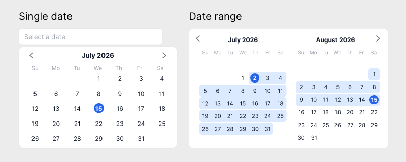
hcg-date-picker is a vanilla JavaScript date picker that attaches to text inputs. It opens a calendar popup (or renders inline), supports single dates, date ranges, multiple dates, month-only, year-only, datetime, time-only modes, and optional day labels via an events map, and syncs the formatted value back to the input. Call hcgDatePicker('#id', options) to create an instance.
Click the month and year title in the calendar header to switch to month view, then click again for a 12-year grid. Pick year, month, and day in sequence - about five clicks for a typical birth date.
Why use hcg-date-picker?
Other libraries are popular but often add weight or extra dependencies. Native <input type="date"> looks different on every browser and lacks range or time styling. hcg-date-picker is a focused form control for plain HTML pages: one small script, sensible defaults, and no framework lock-in. See the feature list below for what it includes.
Live Demo
Click the input below to open a calendar. Click the month/year title to jump to month or year view - useful for birth dates and other far-past selections.
View the full demo page for datetime, range, time-only, min/max, inline, and API examples.
Features
Core capabilities of the library: modes, constraints, formats, locale, keyboard support, and the instance API.
- Zero dependencies - one JS file and companion CSS.
- Single, range, multiple, month, year, and time modes - one input for dates, ranges, multi-select, month/year pickers, or hours and minutes.
- Range hover preview - after the start date, hovering days previews the in-range band.
- Calendar events - show labels under day numbers (prices, holidays, and more).
- Datetime - combine calendar and time selectors with
enableTime. - Inline calendar - always-visible panel under the input.
- Month and year views - click the header title to jump years quickly.
- Min, max, disabled, and enabled dates - block out-of-range days, blacklist specific dates, or whitelist only allowed days.
- Custom formats -
dateFormatandtimeFormattoken patterns. - Locale overrides - weekday names, month names, Today, Clear, AM/PM, separators.
- Keyboard - arrow keys, Enter, Escape when the popup is open.
- Instance API -
open(),setDate(),clear(), and more. - Static helpers -
get(),destroy(),reset(),destroyAll().
Installation
Add the CSS and JavaScript via direct download, npm, or a CDN, then call hcgDatePicker() on your input.
Basic Usage
After you install the files, call hcgDatePicker() on a host element. A text <input> is the usual choice for forms (the library syncs the formatted value into the field). You can also attach to a <button> (or other element) as a custom trigger and read the value from the instance API. The library adds the hcg-date-picker class and builds the calendar panel.
Try the basic usage demo on the interactive demo page.
Date and Time
Set enableTime: true to show hour and minute controls under the calendar. The input value includes both the date and the selected time. Read the result with getFormattedDate() (string) or getDate() (Date with time).
<input type="text" id="meeting-start" placeholder="Date and time" readonly>const picker = hcgDatePicker('#meeting-start', {
enableTime: true,
});
// Date object (includes hours and minutes)
const date = picker.getDate();
// Formatted string (dateFormat + timeFormat), e.g. "2026-07-01 14:30"
const formatted = picker.getFormattedDate();Open the datetime picker demo on the interactive demo page.
Time Only
Use mode: 'time' when you only need hours and minutes. No calendar grid is shown. Set hour12: true for a 12-hour clock with AM/PM. Read the time with getFormattedDate() or take hours/minutes from getDate().
<input type="text" id="alarm" placeholder="Select a time" readonly>const picker = hcgDatePicker('#alarm', {
mode: 'time',
hour12: true,
});
// Date object (use getHours / getMinutes for the selected time)
const date = picker.getDate();
const hours = date && date.getHours();
const minutes = date && date.getMinutes();
// Formatted string (timeFormat), e.g. "02:30 PM"
const formatted = picker.getFormattedDate();See the time-only selector demo on the interactive demo page.
Month Only
Set mode: 'month' to pick a month and year without a day grid. The panel opens on the month view. Default format is Y-m (for example 2026-07). Click the year title to jump years, then choose a month. Use getFormattedDate() for Y-m, or read year/month from getDate().
<input type="text" id="billing-month" placeholder="Select a month" readonly>const picker = hcgDatePicker('#billing-month', {
mode: 'month',
});
// Date object (day is the 1st of the selected month)
const date = picker.getDate();
const year = date && date.getFullYear();
const month = date && (date.getMonth() + 1); // 1-12
// Formatted string (default dateFormat "Y-m"), e.g. "2026-07"
const formatted = picker.getFormattedDate();Try the month-only picker demo on the interactive demo page.
Year Only
Set mode: 'year' to pick a year from a 12-year grid with no month or day selection. Default format is Y (for example 2026). Use the nav arrows to move between year ranges. Read the year with getFormattedDate() or getDate().getFullYear().
<input type="text" id="report-year" placeholder="Select a year" readonly>const picker = hcgDatePicker('#report-year', {
mode: 'year',
});
// Date object (1 January of the selected year)
const date = picker.getDate();
const year = date && date.getFullYear();
// Formatted string (default dateFormat "Y"), e.g. "2026"
const formatted = picker.getFormattedDate();Open the year-only picker demo on the interactive demo page.
Date Range
Set mode: 'range' for a flight-style dual calendar: two months side by side. Click a start date, then an end date. After the start is chosen, hovering days previews the in-range band until you pick the end. Days between both ends highlight, and the input value formats as start to end. Use getDates() for both ends, or getFormattedDate() for the joined string.
<input type="text" id="trip-dates" placeholder="Start to end" readonly>const picker = hcgDatePicker('#trip-dates', {
mode: 'range',
});
// Date objects: [start, end] (length 0, 1, or 2)
const dates = picker.getDates();
const start = dates[0] || null;
const end = dates[1] || null;
// Formatted string, e.g. "2026-07-01 to 2026-07-15"
const formatted = picker.getFormattedDate();Explore the date range demo on the interactive demo page.
Multiple Dates
Set mode: 'multiple' to toggle several dates on one input. Click a day to add it, click again to remove it. Selected values are joined with the locale multipleSeparator (default ', '). The popup stays open so you can keep picking. Use getDates() for the Date array, or getFormattedDate() for the joined string.
<input type="text" id="availability" placeholder="Select multiple dates" readonly>const picker = hcgDatePicker('#availability', {
mode: 'multiple',
});
// Date[] of every selected day
const dates = picker.getDates();
// Formatted string, e.g. "2026-07-01, 2026-07-08, 2026-07-15"
const formatted = picker.getFormattedDate();Try the multiple dates demo on the interactive demo page.
Calendar Events
Pass an events map of Y-m-d keys to string labels to show text under day numbers - useful for ticket prices, holidays, or status notes. Labels are independent of selection and work in single, range, and multiple modes. Update them later with setOption('events', map).
<input type="text" id="flight-day" placeholder="Select a date" readonly>hcgDatePicker('#flight-day', {
events: {
'2026-07-05': '$189',
'2026-07-12': '$249',
'2026-07-18': '$159',
'2026-07-22': 'Sold out',
},
});Open the calendar events demo on the interactive demo page.
Min, Max, Disabled, and Enabled Dates
Limit selectable days with minDate and maxDate, block individual days with disabledDates, or allow only a whitelist with enabledDates. When enabledDates is a non-empty array, only those days can be chosen (still subject to min/max and disabledDates). Out-of-range and blocked days appear muted and cannot be chosen.
<input type="text" id="booking" placeholder="Within allowed range" readonly>const today = new Date();
const minDate = new Date(today.getFullYear(), today.getMonth(), 1);
const maxDate = new Date(today.getFullYear(), today.getMonth() + 1, 0);
hcgDatePicker('#booking', {
minDate: minDate,
maxDate: maxDate,
disabledDates: [
new Date(today.getFullYear(), today.getMonth(), 15),
],
});Test min and max date limits on the interactive demo page.
Inline Calendar
Set inline: true to keep the calendar always visible under the input instead of a popup. Useful for dashboards, booking layouts, and always-on date selection.
<input type="text" id="schedule" placeholder="Selected date" readonly>hcgDatePicker('#schedule', {
inline: true,
});View the always-visible inline calendar on the interactive demo page.
Options Reference
Quick reference for all option types and defaults. See the Options copy-paste examples section below for copy-paste examples.
| Option | Type | Default | Description |
|---|---|---|---|
mode | string | 'single' | Picker mode: single, range, multiple, month, year, or time only. |
enableTime | boolean | false | Show hour and minute controls under the calendar. |
inline | boolean | false | Render the calendar panel below the input instead of a popup. |
dateFormat | string | 'Y-m-d' | Output pattern for the date portion (see format tokens). |
timeFormat | string | 'H:i' | Output pattern for the time portion. |
hour12 | boolean | false | Use 12-hour clock with AM/PM when formatting or picking time. |
minDate | Date | string | null | null | Earliest selectable calendar day. |
maxDate | Date | string | null | null | Latest selectable calendar day. |
disabledDates | array | [] | Specific dates that cannot be selected. |
enabledDates | array | [] | When non-empty, only these dates can be selected (whitelist). |
events | object | null | null | Map of Y-m-d keys to labels shown under day numbers. |
firstDayOfWeek | number | 0 | Week start: 0=Sunday through 6=Saturday. |
locale | object | null | null | Override weekday names, month names, Today, Clear, AM, PM, rangeSeparator, and multipleSeparator. |
closeOnSelect | boolean | true | Close the popup after a complete selection (not inline). |
openOnFocus | boolean | true | Open the popup when the input receives keyboard focus (click still opens). |
showToday | boolean | true | Show the Today button in the panel footer. |
showClear | boolean | true | Show the Clear button in the panel footer. |
appendTo | element | string | null | null | Parent for the popup panel (default: document.body). |
disabled | boolean | false | Disable the input and block opening the panel. |
theme | string | 'light' | Panel theme: 'light' or 'dark' (sets CSS variables via .hcg-date-picker-panel-dark). |
onChange | function | null | null | Called when the selection changes. |
onOpen | function | null | null | Called when the popup opens. |
onClose | function | null | null | Called when the popup closes. |
Options
Copy-paste examples for each option. See Options reference types and defaults table above for types and default values.
API Reference
hcgDatePicker(selector, options) returns an instance with these methods. The factory also exposes hcgDatePicker.version, get(), destroy(), reset(), and destroyAll().
| Method / Property | Returns | Description |
|---|---|---|
| open() | instance | Show the calendar popup and position it under the input. |
| close() | instance | Hide the popup panel. |
| toggle() | instance | Open if closed, close if open. |
| getDate() | Date | null | Selected date for single or datetime mode. |
| getFormattedDate() | string | Selected value formatted with dateFormat / timeFormat (from internal state, not input.value). |
| setDate(value, triggerChange?) | instance | Set one date. Second argument defaults to true for onChange. |
| getDates() | Date[] | All selected dates (range or multiple mode). |
| setDates(values, triggerChange?) | instance | Set one or more dates (range or multiple mode). |
| clear() | instance | Clear the selection and input value. |
| gotoDate(value) | instance | Move the calendar view to a month without changing selection. |
| setOption(key, value) | instance | Update any option at runtime. |
| getOption(key) | any | Read a current option value. |
| enable() | instance | Re-enable the picker. |
| disable() | instance | Disable the picker and close the popup. |
| reset() | instance | Re-parse the input value and refresh the view. |
| destroy() | void | Remove listeners, panel DOM, and the instance reference. |
| Method / Property | Returns | Description |
|---|---|---|
| hcgDatePicker.get(target) | instance | null | Static helper to retrieve an instance. |
| hcgDatePicker.destroy(target) | boolean | Static helper to destroy an instance. |
| hcgDatePicker.reset(target) | boolean | Static helper to reset an instance. |
| hcgDatePicker.destroyAll() | void | Destroy every active instance on the page. |
| hcgDatePicker.version | string | Library version string (currently '1.0.0'). |
Callbacks
The library reports value and panel changes through onChange, onOpen, and onClose. Pass them when you create the instance, or update later with setOption().
Using with React
Create the picker in useEffect and call destroy() on unmount. Keep the input in JSX.
Open the React date picker demo on StackBlitz
import { useEffect, useRef } from "react";
import hcgDatePicker from "hcg-date-picker";
import "hcg-date-picker/hcg-date-picker.css";
export const EventDateField = () => {
const inputRef = useRef(null);
useEffect(() => {
const picker = hcgDatePicker(inputRef.current, { enableTime: true });
return () => picker.destroy();
}, []);
return (
<input ref={inputRef} type="text" placeholder="Select date and time" readOnly />
);
};Styling and Customization
Colors, borders, and accents use CSS variables on .hcg-date-picker-panel. Override them for a custom light or dark look, or set theme: 'dark' for the built-in dark preset.
/* Custom light accents */
.hcg-date-picker-panel {
  --hcg-dp-accent: #0f766e;
  --hcg-dp-accent-hover: #0d9488;
  --hcg-dp-hover-bg: #ccfbf1;
  --hcg-dp-hover-text: #115e59;
}

/* Or redefine the dark preset values */
.hcg-date-picker-panel-dark {
  --hcg-dp-bg: #0b1220;
  --hcg-dp-border: #1e293b;
  --hcg-dp-text: #e2e8f0;
  --hcg-dp-accent: #38bdf8;
  --hcg-dp-accent-hover: #7dd3fc;
}hcgDatePicker('#dark-date', {
theme: 'dark',
});
/* Toggle at runtime */
picker.setOption('theme', 'light');Browser Support
Modern browsers with CSS flexbox and Pointer Events. IE11 is not supported.
- Chrome, Edge, Firefox, Safari (current versions)
- iOS Safari and Chrome for Android
FAQ
Common questions about dependencies, date modes, events, limits, dark theme, and CDN setup.
Does hcg-date-picker have any dependencies?
No. hcg-date-picker is plain vanilla JavaScript with zero dependencies. Include hcg-date-picker.js and hcg-date-picker.css and you are ready to go.
Can I pick a date range with one input?
Yes. Set mode to range on a single text input. The popup shows two months side by side like a flight booking calendar. After you pick the start date, hovering days previews the in-range band. The library formats the value as start to end and highlights days between both ends.
Can I select multiple dates?
Yes. Set mode to multiple to toggle several dates on one input. Click a selected day again to remove it. Values are joined with the locale multipleSeparator (comma by default).
How do I show prices or labels under calendar days?
Pass an events object mapping Y-m-d date keys to string labels. Each matching day shows the label under the day number, similar to ticket prices on a booking calendar.
How do I select a birth year quickly?
Click the month and year title in the calendar header to open the month grid, click the year title again for a 12-year range, pick a year, then a month, then the day. Birth dates typically take about five clicks.
Does it support time only inputs?
Yes. Set mode to time for hour and minute selectors without a calendar. Combine enableTime: true with mode single for datetime pickers.
Can I pick month only or year only?
Yes. Set mode to month for a month and year picker (default format Y-m). Set mode to year for a year-only grid (default format Y). Neither mode shows the day calendar.
Can I set min and max dates?
Yes. Pass minDate and maxDate as Date objects or structured strings such as Y-m-d. Use disabledDates for specific blocked days, or enabledDates for a whitelist of only allowed days.
Does it support a dark theme?
Yes. Set theme: 'dark' for the built-in dark palette (class hcg-date-picker-panel-dark). Override the --hcg-dp-* CSS variables for custom light or dark colors, or call setOption('theme', 'light') to switch at runtime.
Can I load hcg-date-picker from a CDN?
Yes. Add link and script tags for hcg-date-picker.css and hcg-date-picker.js from jsDelivr, unpkg, or your own hosted copy, then call hcgDatePicker("#input", options).
Related
Related links