Lightweight JavaScript Carousel Library
This lightweight JavaScript carousel library helps you build image sliders, product galleries, testimonial rotators, and card rows without React, jQuery, or Swiper. Touch swipe, autoplay, loop, arrows, dots, multiple visible slides, and keyboard navigation - all in a zero-dependency script that matches your other HCG libraries.
This page covers installation, live demos, options, API methods, React usage, and styling. Open the interactive demo page for every example in one place.
Table of Contents
What is hcg-carousel?
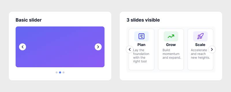
hcg-carousel is a vanilla JavaScript carousel for sliding content horizontally inside a viewport. Mark up a .hcg-carousel-viewport and .hcg-carousel-track, add slide children, then call HcgCarousel('#id') or HcgCarousel.init() to initialize every .hcg-carousel element on the page. Arrows and dots are created automatically when enabled.
Why use hcg-carousel?
Swiper and Slick are powerful but large. Bootstrap carousels require Bootstrap CSS and JS. hcg-carousel is a focused slider for plain HTML pages: one small script, sensible defaults, and no framework lock-in. See the feature list below for what it includes.
Live Demo
Swipe, use the arrows, or click a dot. Autoplay runs every 4 seconds and pauses on hover.
View the full demo page for autoplay, multi-slide, API, and data-attribute examples.
Comparison
| Feature | hcg-carousel | Bootstrap carousel | Swiper |
|---|---|---|---|
| Dependencies | None | Bootstrap CSS + JS | Swiper bundle |
| Touch swipe | Yes | Limited | Yes |
| Multiple visible slides | slidesToShow | No | Yes |
| Autoplay | Yes | Yes | Yes |
| Data-attribute init | Yes | Partial | Yes |
| Vanilla JS API | HcgCarousel() | jQuery-style | Class-based |
| Approximate size | Small | Large (full Bootstrap) | Medium to large |
Features
- Zero dependencies - one JS file and companion CSS.
- Pointer swipe - drag left or right to change slides.
- Autoplay - boolean or custom interval in milliseconds.
- Loop - wrap from last to first slide, or linear mode.
- Arrows and dots - auto-created or use your own markup.
- slidesToShow and gap - card rows and product grids.
- slidesToScroll - advance multiple slides per navigation step.
- update() / refresh() - recalculate after dynamic DOM changes.
- Accessibility - focus pause and
aria-liveannouncements. - Keyboard - ArrowLeft and ArrowRight when focused.
- Static helpers -
get(),destroy(),reset(),destroyAll().
Installation
Basic Usage
After you install the files, build a three-level HTML wrapper on a root element, put your slide content inside the track, then call HcgCarousel(). Arrows and dots are created for you when those options are enabled.
Required markup (outer to inner):
- Root - container with class
hcg-carousel. Add anidor use another selector for JavaScript init. - Viewport - child
.hcg-carousel-viewport. Clips overflow and handles swipe drag. - Track - child
.hcg-carousel-trackinside the viewport. This element moves horizontally. - Slides - one or more direct element children inside the track (images, cards, text, or any HTML). You do not need to add
.hcg-carousel-slideyourself; the library applies it plus slide ARIA labels on init.
Minimal structure:
.hcg-carousel <-- root (your container)
.hcg-carousel-viewport <-- required wrapper
.hcg-carousel-track <-- required wrapper
<div> slide 1 </div> <-- direct child = one slide
<div> slide 2 </div>
<div> slide 3 </div>Optional in HTML: add your own .hcg-carousel-prev, .hcg-carousel-next, or .hcg-carousel-dots inside the root if you want custom control markup. Otherwise the library inserts them when arrows and dots are true.
Try the basic usage demo on the interactive demo page.
Autoplay
Set autoplay: true for the default 3 second interval, or pass a number for custom timing. Autoplay pauses on hover when pauseOnHover is true.
const carousel = HcgCarousel("#hero", {
autoplay: 5000,
pauseOnHover: true,
});
document.getElementById("pause-btn").addEventListener("click", () => {
carousel.pause();
});Try the autoplay demo on the interactive demo page.
Multiple Visible Slides
Show a row of cards or thumbnails with slidesToShow and gap. Use loop: false when you want arrows to stop at the ends.
HcgCarousel("#pricing-row", {
slidesToShow: 3,
gap: 16,
loop: false,
});Try the multiple visible slides demo on the interactive demo page.
Options Reference
Quick reference for all option types and defaults. See the Options copy-paste section below for copy-paste examples.
| Option | Type | Default | Description |
|---|---|---|---|
index | number | 0 | Starting slide index. |
loop | boolean | true | Wrap from last slide to first. |
autoplay | boolean | number | false | true uses interval; number sets ms. |
interval | number | 3000 | Autoplay delay when autoplay: true. |
pauseOnHover | boolean | true | Pause autoplay while pointer is over carousel. |
pauseOnFocus | boolean | true | Pause autoplay while focus is inside the carousel. |
slidesToShow | number | 1 | Visible slides at once. |
slidesToScroll | number | 1 | Slides advanced per next() / prev(). |
gap | number | 0 | Gap between slides in pixels. |
duration | number | 400 | Slide transition duration in ms. |
easing | string | "ease" | CSS easing for slide transition. |
arrows | boolean | true | Show prev/next buttons. |
dots | boolean | true | Show dot navigation. |
swipe | boolean | true | Pointer drag to change slides. |
keyboard | boolean | true | Arrow keys when carousel is focused. |
disabled | boolean | false | Disable all interaction. |
ariaLabel | string | "Carousel" | aria-label on root region. |
onChange | function | null | Called when active index changes (before transition ends). |
afterChange | function | null | Called after the slide transition completes. |
Options
Copy-paste examples for each option. See Types and defaults table Options Reference above for types and default values.
API Reference
HcgCarousel(selector, options) returns an instance with these methods. The factory also exposes HcgCarousel.version, init(), get(), destroy(), reset(), and destroyAll().
| Method / Property | Returns | Description |
|---|---|---|
| goTo(index, animate?) | instance | Move to slide index. Second argument defaults to true. |
| next() | instance | Advance by slidesToScroll (default 1). |
| prev() | instance | Move back by slidesToScroll. |
| play() | instance | Start or resume the autoplay timer. |
| pause() | instance | Stop the autoplay timer. |
| getIndex() | number | Current active slide index. |
| getSlideCount() | number | Total number of slides in the track. |
| update() / refresh() | instance | Re-read slides from the track, rebuild dots, and remeasure. |
| setOption(name, value) | instance | Update any option at runtime. |
| getOption(name) | any | Read a current option value. |
| enable() | instance | Re-enable interaction and autoplay. |
| disable() | instance | Disable arrows, dots, swipe, keyboard, and autoplay. |
| reset() | instance | Return to the initial index and restart autoplay if enabled. |
| destroy() | void | Remove listeners, library-created controls, and the instance reference. |
| element | Element | The root .hcg-carousel element. |
| HcgCarousel.init(root?, options?) | array | Auto-initialize every .hcg-carousel inside root (default document). |
| HcgCarousel.get(target) | instance | null | Static helper to retrieve an instance by element or selector. |
| HcgCarousel.destroy(target) | boolean | Static helper to destroy an instance. |
| HcgCarousel.reset(target) | boolean | Static helper to reset an instance. |
| HcgCarousel.destroyAll() | void | Destroy every active instance on the page. |
| HcgCarousel.version | string | Library version string (currently '1.0.0'). |
Callbacks
The library reports slide changes through onChange (when the index updates) and afterChange (when the CSS transition finishes). Pass them when you create the instance, or update later with setOption().
Using with React
Create the carousel in useEffect and call destroy() on unmount. Keep slide markup in JSX inside the track.
Try the live React demo on StackBlitz
import { useEffect, useRef } from "react";
import HcgCarousel from "hcg-carousel";
import "hcg-carousel/hcg-carousel.css";
export const Gallery = ({ items }) => {
const rootRef = useRef(null);
useEffect(() => {
const carousel = HcgCarousel(rootRef.current, { autoplay: 4000 });
return () => carousel.destroy();
}, [items.length]);
return (
<div ref={rootRef} className="hcg-carousel">
<div className="hcg-carousel-viewport">
<div className="hcg-carousel-track">
{items.map((item) => (
<div key={item.id}>{item.node}</div>
))}
</div>
</div>
</div>
);
};Styling and Customization
Override default arrow and dot styles, or provide your own buttons with classes .hcg-carousel-prev and .hcg-carousel-next.
.hcg-carousel {
  --hcg-carousel-duration: 300ms;
}

.hcg-carousel-arrow {
  background: #111827;
  color: #fff;
  border-color: transparent;
}

.hcg-carousel-dot-active {
  background: #f59e0b;
}
Browser Support
Modern browsers with CSS flexbox, CSS transforms, and Pointer Events. IE11 is not supported.
- Chrome, Edge, Firefox, Safari (current versions)
- iOS Safari and Chrome for Android
FAQ
Does hcg-carousel have any dependencies?
No. hcg-carousel is plain vanilla JavaScript with zero dependencies. Include hcg-carousel.js and hcg-carousel.css and you are ready to go.
Can I show more than one slide at a time?
Yes. Set slidesToShow to 2, 3, or more and optionally gap for spacing between slides. Use slidesToScroll to advance multiple slides per step.
How do I enable autoplay?
Pass autoplay: true to use the default interval (3000 ms), or autoplay: 5000 for a custom interval in milliseconds. Call pause() or play() on the instance at any time.
Does it support touch swipe?
Yes. Pointer events on the viewport detect horizontal swipes. Set swipe: false to disable drag navigation.
Can I load hcg-carousel from a CDN?
Yes. Add link and script tags for hcg-carousel.css and hcg-carousel.js from jsDelivr, unpkg, or your own hosted copy, then call HcgCarousel('.selector') or HcgCarousel.init().
Related
Related links