Lightweight JavaScript Split Pane Library
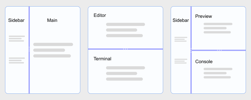
Build IDE-style sidebars, editor and preview stacks, and multi-column dashboards in plain HTML and JavaScript. hcg-split-pane is a zero-dependency library built on the Pointer Events API, so mouse, touch, and pen input share one code path. Split two, three, or more panes in one instance; nest horizontal and vertical splits; clamp each pane with min and max sizes; and use percentage or pixel-based sizes without React, jQuery, or a heavy panel toolkit.
On this page you will find live demos, installation (direct download, npm, CDN), a full options reference, React notes, and copy-paste examples for nested splits, multi-pane layouts, pixel sizes, and callbacks.
Table of Contents
What is hcg-split-pane?
hcg-split-pane is a lightweight vanilla JavaScript library for resizable split layouts. Call new HcgSplitPane() on a container with two or more child panes (or pass a panes array of selectors), drag gutters to resize, set per-pane minimum and maximum sizes in pixels, and listen to onDragStart, onDrag, and onDragEnd callbacks - without React, jQuery, or any other dependency.
Why use hcg-split-pane?
Most split-pane solutions are React components or larger layout toolkits when you only need a resizable sidebar or a simple editor and preview stack. react-split-pane requires React; Split.js and allotment are excellent but may be more than you need for a plain HTML page.
hcg-split-pane fills that gap: a small, dependency-free library built on Pointer Events for mouse, touch, and pen. It suits vanilla pages, React or Vue dashboards, and nested IDE-style layouts without pulling in a framework-specific panel library. See the comparison table for how it differs from react-split-pane and Split.js, and Features for the full capability list.
Live Demo
Drag the gutters below. Each example shows a different option. For every demo in one place, open the full interactive demo page. hcg-split-pane live demo
Comparison Table
How hcg-split-pane compares with common alternatives.
| Feature | hcg-split-pane | react-split-pane | Split.js / allotment |
|---|---|---|---|
| Dependencies | None | Requires React | Varies |
| File size | Small (one JS file + CSS) | React component + peer deps | Larger multi-pane toolkits |
| Framework requirement | None (script tag friendly) | React only | Vanilla or React-focused |
| Multi-pane (3+) | Built in - one instance, N panes | Typically two panes per component | Built in |
| Nested horizontal + vertical | Multiple instances | Nested React components | Multiple instances |
| Min / max pane sizes | Per-pane px min and max | minSize prop | minSize / maxSize (varies) |
| Pixel-based sizes | sizeUnit: 'pixel' | Percent-focused | Pixel support (varies) |
| Touch / pointer drag | Pointer Events | Mouse events (varies by fork) | Mouse / touch support |
| Data attributes | Yes (data-hcg-* + HcgSplitPane.init()) | No | Manual |
| Lifecycle callbacks | Yes (onDragStart, onDrag, onDragEnd) | onChange (varies) | onDrag (varies) |
Installation
Basic Usage
Give a container an explicit height, include the CSS and JS files, then pass a selector or DOM element to new HcgSplitPane(). Direct children become panes unless you pass a panes array.
<div id="split" style="height: 320px;">
<div>Left panel</div>
<div>Right panel</div>
</div>const split = new HcgSplitPane('#split', {
direction: 'horizontal',
sizes: [50, 50],
onDragEnd(detail) {
console.log('Sizes:', detail.sizes);
}
});Features
Everything included in the library at a glance:
- Zero dependencies - one JS file and one CSS file.
- Pointer Events - mouse, touch, and pen through one code path.
- Multi-pane splits - two, three, or N panes in one instance.
- Horizontal and vertical - side-by-side or stacked; switch direction at runtime.
- Nested layouts - combine multiple instances on different axes.
- Min and max sizing - per-pane px limits stop the gutter at each edge.
- Pixel or percent sizes -
sizeUnit: 'pixel'for fixed-style sidebars. - Panes by selector - optional
panesarray for flexible DOM structure. - Size persistence - stores last sizes in
data-hcg-sizeson the container. - Data attributes -
data-hcg-split-paneplus option attributes; callHcgSplitPane.init()when ready. - Runtime options - change any option later with
option()/setOption(). - Multiple elements - one selector can return an array of instances.
- Callbacks -
onDragStart,onDrag, andonDragEndwith live size data. - Instance API - enable, disable, getSizes, setSizes, and destroy.
- UMD / ESM / global - works with bundlers, require, or a plain script tag.
- Small footprint - tiny library; works in every modern browser.
Using with React
Create the split-pane instance inside a useEffect hook and clean it up with destroy() when the component unmounts.
import { useEffect, useRef } from "react";
import HcgSplitPane from "hcg-split-pane";
import "hcg-split-pane/hcg-split-pane.css";
function EditorLayout() {
const hostRef = useRef(null);
const splitRef = useRef(null);
useEffect(() => {
splitRef.current = new HcgSplitPane(hostRef.current, {
direction: "horizontal",
sizes: [30, 70]
});
return () => splitRef.current?.destroy();
}, []);
return (
<div ref={hostRef} style={{ height: 400 }}>
<div>Sidebar</div>
<div>Editor</div>
</div>
);
}Data Attributes
Every option that takes a simple value can be set in HTML. Mark containers with data-hcg-split-pane, then call HcgSplitPane.init() once the DOM is ready.
| Attribute | Maps to option | Example |
|---|---|---|
| data-hcg-split-pane | init target | data-hcg-split-pane |
| data-hcg-direction | direction | data-hcg-direction="horizontal" |
| data-hcg-sizes | sizes | data-hcg-sizes="35,65" |
| data-hcg-size-unit | sizeUnit | data-hcg-size-unit="pixel" |
| data-hcg-min-size | minSize | data-hcg-min-size="120,200" |
| data-hcg-max-size | maxSize | data-hcg-max-size="240,Infinity" |
| data-hcg-gutter-size | gutterSize | data-hcg-gutter-size="8" |
| data-hcg-disabled | disabled | data-hcg-disabled |
| data-hcg-sizes (stored) | restored sizes | data-hcg-sizes="35,65" (written on drag end) |
<div
  data-hcg-split-pane
  data-hcg-direction="horizontal"
  data-hcg-sizes="35,65"
  data-hcg-min-size="120,160">
  <div>Left</div>
  <div>Right</div>
</div>HcgSplitPane.init(); // every [data-hcg-split-pane] elementTo initialize elements added later, call HcgSplitPane.init() again, or call the constructor directly on the new element.
Options Reference
Pass these as the second argument to new HcgSplitPane(element, options).
| Option | Type | Default | Description |
|---|---|---|---|
| direction | 'horizontal' | 'vertical' | 'horizontal' | Split axis. |
| panes | (string | Element)[] | null | null | Pane selectors or elements; default=host children. |
| sizes | Number[] | even split | Initial sizes - percent or px per sizeUnit. |
| sizeUnit | 'percent' | 'pixel' | 'percent' | Unit for sizes, getSizes(), setSizes(). |
| minSize | Number | Number[] | 0 | Minimum pane size in pixels. |
| maxSize | Number | Number[] | Infinity | Maximum pane size in pixels. |
| gutterSize | Number | 6 | Gutter width or height in pixels. |
| disabled | Boolean | false | Disable gutter dragging. |
| onDragStart | Function or null | null | Fired when a pointer drag begins. Receives (detail). |
| onDrag | Function or null | null | Fired while dragging. Receives (detail). |
| onDragEnd | Function or null | null | Fired when a pointer drag ends. Receives (detail). |
detail is { event, sizes, gutterIndex }.
Instance Methods
The constructor returns a split-pane instance with the following methods.
| Method | Description |
|---|---|
| option(name) | Gets an option value. |
| option(name, value) | Sets an option value. Returns the instance for chaining. |
| setOption(name, value) | Alias for option(name, value). Re-applies layout when direction, sizes, or limits change. |
| getSizes() | Returns current sizes as an array (percentages, or pixels when sizeUnit: 'pixel'). |
| setSizes(sizes) | Sets sizes; length must match pane count; clamped to min/max. Updates data-hcg-sizes. |
| enable() | Turns gutter dragging on. Returns the instance for chaining. |
| disable() | Turns gutter dragging off without removing listeners. Returns the instance. |
| destroy() | Removes gutters, restores original DOM when panes was used, strips listeners. Use this for SPA or framework cleanup. |
Read the library version from the static property:
console.log(HcgSplitPane.version);Static helpers on the constructor:
HcgSplitPane.init();        // every [data-hcg-split-pane] element
HcgSplitPane.destroyAll();  // destroy every active instance

var items = HcgSplitPane('.layout', { sizes: [30, 70] });
if (Array.isArray(items)) {
  items.forEach(function (s) { s.disable(); });
}
Callbacks
Pass lifecycle hooks as option functions. Each callback receives a single detail object. Inside the callback, this is the HcgSplitPane instance.
CSS Classes
hcg-split-pane adds class names you can target for styling. Gutter elements are injected between panes. The default stylesheet draws a centered three-dot grip on each gutter with a CSS ::after pseudo-element (no extra DOM nodes).
| Class | Applied to |
|---|---|
| hcg-split-pane | The container element. |
| hcg-split-pane-horizontal | Container when direction: 'horizontal' (side-by-side panes). |
| hcg-split-pane-vertical | Container when direction: 'vertical' (stacked panes). |
| hcg-split-pane_pane | Each pane element. |
| hcg-split-pane_gutter | Each draggable gutter between panes. Default styles include a centered dot grip via ::after (stacked dots for a vertical gutter, row of dots for a horizontal gutter). |
| hcg-split-pane_gutter-active | Applied to the gutter being dragged. Uses a stronger background color and overrides hover while active. |
| hcg-split-pane-disabled | Container while dragging is disabled. |
| body.hcg-split-pane-dragging | <body> during a pointer drag (global resize cursor). |
Theme variables (set on the split container or a parent):
--hcg-split-gutter-bg- default gutter background--hcg-split-gutter-hover- gutter background on hover--hcg-split-gutter-active- gutter background while dragging--hcg-split-gutter-grip- dot grip color--hcg-split-gutter-grip-hover- dot grip color on hover
Hide or restyle the default grip with CSS only:
/* Hide the default dot grip */
.hcg-split-pane_gutter::after {
  display: none;
}

/* Theme the gutter bar and grip */
.hcg-split-pane {
  --hcg-split-gutter-bg: rgba(99, 102, 241, 0.18);
  --hcg-split-gutter-hover: rgba(99, 102, 241, 0.35);
  --hcg-split-gutter-active: rgba(67, 56, 202, 0.92);
  --hcg-split-gutter-grip: rgba(71, 85, 105, 0.55);
  --hcg-split-gutter-grip-hover: rgba(71, 85, 105, 0.75);
}
Browser Support
hcg-split-pane works in all modern browsers that support the Pointer Events API and flexbox.
| Browser | Supported |
|---|---|
| Google Chrome | Yes |
| Mozilla Firefox | Yes |
| Microsoft Edge | Yes |
| Safari | Yes |
| Opera | Yes |
| Mobile browsers | Yes (touch gutter dragging supported) |
License
Released under the MIT License. Free for personal and commercial use. Copyright HTML Code Generator.
Frequently asked questions
Does hcg-split-pane have any dependencies?
No. hcg-split-pane is plain vanilla JavaScript with zero dependencies. Include hcg-split-pane.js and hcg-split-pane.css and you are ready to go.
Does hcg-split-pane work on touch devices?
Yes. It is built on the Pointer Events API, so mouse, touch, and pen input all work through one code path. Gutters set touch-action: none so dragging does not scroll the page accidentally.
Can hcg-split-pane split more than two panes?
Yes. One HcgSplitPane instance supports two, three, or more panes in a single row or column. Pass sizes and minSize arrays with one value per pane, for example sizes: [20, 55, 25] for a three-column layout.
Can I use hcg-split-pane with React?
Yes. Create the HcgSplitPane instance inside a useEffect hook, keep a ref to the container element, and call destroy() in the cleanup function when the component unmounts. The Using with React section above has a full example.
Can I load hcg-split-pane from a CDN?
Yes. Add <link> and <script> tags for hcg-split-pane.css and hcg-split-pane.js from jsDelivr, unpkg, or your own hosted copy, then call new HcgSplitPane('.selector'). The Installation section above includes CDN usage examples.
Related
Related links