Searchable Select Dropdown for HTML Select Elements
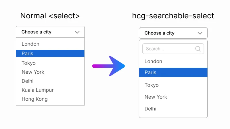
Turn any native <select> into a searchable dropdown without changing how your form works. hcg-searchable-select is a zero-dependency JavaScript library (~6 KB gzipped) that adds type-to-search filtering, match highlighting, keyboard navigation, and full ARIA accessibility while keeping the real select in the DOM for submission and validation.
Table of Contents
What is hcg-searchable-select?
hcg-searchable-select is a lightweight vanilla JavaScript library for making standard HTML select elements searchable. Add a data-hcg-select attribute or call hcgSelect() on a selector, and users can filter long option lists by typing in a search box - without React, jQuery, or any other dependency.
Why use hcg-searchable-select?
Long dropdowns are slow to scan on desktop and painful on mobile. Most searchable-select libraries bundle remote data, tagging, and multi-select you may not need. hcg-searchable-select stays small (~6 KB gzipped, single-select only) and focuses on one job: make a normal single-select searchable while preserving native form behavior - no jQuery, no framework.
- Zero dependencies - one JS file and one CSS file, nothing else.
- Native form parity - the real
<select>stays in the DOM for submission,name, labels, andform.reset(). The visible control mirrorsaria-requiredandaria-invalid. - Type-to-search - filter options as you type with match highlighting.
- Optgroup support - native
<optgroup>elements become group headers. - Clearable selection - optional clear button returns to a placeholder option.
- Keyboard and screen reader friendly - ARIA combobox and listbox roles, arrow-key navigation, type-ahead while closed.
- Mobile-aware - search input is not auto-focused on open, so the on-screen keyboard does not cover the list.
- Smart positioning - panel auto-flips upward when there is not enough room below.
- Dynamic options - adding, removing, or renaming options rebuilds the list automatically.
- One-attribute setup - add
data-hcg-selectto markup you already have.
Features
The library includes many advanced features commonly found in premium select components:
- Type-to-search filtering with match highlighting in the dropdown.
- Native optgroup support - group headers hide when all their options are filtered out.
- Optional clear button - returns selection to the first empty-value placeholder option.
- Keyboard navigation - arrow keys, Home/End, Enter, Escape, and type-ahead while closed.
- ARIA accessibility - combobox and listbox roles,
aria-activedescendant,aria-selected. - Form validation -
required,aria-required, andaria-invalidmirror the native select. - Disabled options and selects - respected and synced at runtime.
- Smart auto-flip - panel opens upward when there is not enough room below.
- Mobile-friendly - search input is not auto-focused on open.
- Dynamic option - DOM changes rebuild the list via MutationObserver.
- Programmatic value sync - setting
select.valueorselectedIndexupdates the label. - Multiple selects - initialize as many widgets as you need on one page.
- Instance API - open, close, refresh, clear, enable, disable, and destroy.
- Tiny footprint - about 6 KB JavaScript gzipped, ~8 KB total with CSS.
Comparison Table
How hcg-searchable-select compares with common alternatives for single-select search.
| Feature | hcg-searchable-select | Select2 | Choices.js | Tom Select |
|---|---|---|---|---|
| Dependencies | None | Requires jQuery | None | None |
| Size (JS, gzipped) | ~6 KB | Larger, plus jQuery | Larger | Larger |
| Keeps native select for forms | Yes | Yes | Yes | Yes |
| Optgroup support | Yes | Yes | Yes | Yes |
| Multi-select / tagging | No (by design) | Yes | Yes | Yes |
| Remote data (AJAX) | No | Yes | Yes | Yes |
| Best for | Lightweight searchable single select | jQuery projects | Text inputs + selects | Feature-rich selects |
Demo
Try the selects below. Click to open, then type to filter. For every demo in one place, see the full interactive demo page.
Installation
Install it with npm, load it from a CDN, or download the files directly and host them yourself. Once included, simply apply the library to a standard HTML <select> element to instantly add search functionality, keyboard navigation, and an improved user experience without changing your existing form structure.
Usage
1. Include the files
<link rel="stylesheet" href="hcg-select.css">
<script src="hcg-select.js"></script>
2. Add a select
The quickest way is to add the data-hcg-select attribute. Selects with this attribute are enhanced automatically when the page loads.
<select id="country" data-placeholder="Select a country" data-hcg-select>
  <option value="">- Select a country -</option>
  <option value="in">India</option>
  <option value="us">United States</option>
  <option value="uk">United Kingdom</option>
</select>
That's it. The widget reads the options, hides the native select, and renders a searchable dropdown.
Manual initialization
Call hcgSelect() with a CSS selector or DOM element and optional settings. Calling it again on the same select returns the existing instance.
hcgSelect("#country", {
  placeholder: "Select a country",
  searchPlaceholder: "Type to search...",
  noResultsText: "Nothing found"
});
Re-initialize elements added later
hcgSelect.init();              // scan the whole document
hcgSelect.init(containerEl);   // scan inside a specific element
Data attributes
Common options can be set in HTML without JavaScript.
| Attribute | Maps to | Example |
|---|---|---|
| data-hcg-select | enables auto-init | data-hcg-select |
| data-placeholder | placeholder | data-placeholder="Select a country" |
| data-clearable | clearable | data-clearable or data-clearable="false" |
Options
hcg-searchable-select includes a flexible set of configuration options that allow you to customize placeholders, search behavior, focus handling, messages, and event callbacks. These settings make it easy to adapt the dropdown to different user experiences while keeping the API simple and developer-friendly.
| Option | Type | Default | Description |
|---|---|---|---|
| placeholder | string | "Select..." | Text shown when nothing is selected (or use data-placeholder). |
| searchPlaceholder | string | "Search..." | Placeholder for the search input inside the panel. |
| noResultsText | string | "No results" | Message when no option matches the filter. |
| clearable | boolean | false | Show a clear button (requires a placeholder option). |
| typeAhead | boolean | true | Jump to a matching option by typing while the panel is closed. |
| onChange | function | - | Called as (value, option, select) when a value is committed. |
| onOpen | function | - | Called as (select, api) when the panel opens. |
| onClose | function | - | Called as (select, api) when the panel closes. |
Events and callbacks
You have two ways to react when the user picks an option - use whichever fits.
Instance methods API
Calling hcgSelect() on a <select> returns an API object. Calling it again on the same element returns the existing instance (no duplicate widget).
Grouped options (optgroup)
Native <optgroup> elements are rendered as non-selectable group headers, with indented options grouped beneath them. Disabled optgroups disable all child options.
<select data-hcg-select>
  <option value="">- Pick food -</option>
  <optgroup label="Fruits">
    <option value="apple">Apple</option>
    <option value="mango">Mango</option>
  </optgroup>
  <optgroup label="Drinks">
    <option value="tea">Tea</option>
  </optgroup>
</select>Clearable selection
Add data-clearable (or pass clearable: true) to show a clear button when a real value is selected. Because a native select always has a value, clearing returns to the first placeholder option (<option value="">), so that option must exist.
<select data-hcg-select data-clearable data-placeholder="Choose a city" id="city">
  <option value="">- Choose a city -</option>
  <option value="par">Paris</option>
  <option value="tok" selected>Tokyo</option>
</select>JavaScript usage:
hcgSelect("#city", {
  clearable: true
});
Keyboard and accessibility
hcg-searchable-select follows the ARIA combobox and listbox pattern. The hidden native select uses inert when supported so it never holds focus; associated labels focus the custom control instead.
When the control is focused and closed
| Key | Action |
|---|---|
| ArrowDown / ArrowUp | Step to the next or previous selectable option (skips disabled and placeholder). |
| Typing a letter | Type-ahead: jump to the first option starting with the typed characters. |
| Enter / Space / Alt+ArrowDown | Open the search panel. |
| Delete / Backspace | Clear selection when clearable is enabled. |
When the panel is open
| Key | Action |
|---|---|
| Type | Filter the option list in the search input. |
| ArrowDown / ArrowUp | Move the highlight (wraps); does not commit until Enter. |
| Home / End | Highlight the first or last selectable option. |
| Enter | Select the highlighted option and close. |
| Escape | Close the panel and return focus to the control. |
| Tab | Move focus out, which closes the panel. |
Native parity notes
- Disabled options (
<option disabled>) are greyed out and cannot be selected. - Disabled select (
<select disabled>) renders a non-interactive widget. Togglingselect.disabledat runtime is reflected automatically. - Placeholder vs empty value: only the first option with an empty value is treated as the placeholder and hidden from the list.
- Programmatic changes: setting
select.valueorselect.selectedIndexupdates the displayed label;form.reset()restores it. - Dynamic options: adding, removing, renaming, or disabling options rebuilds the list automatically.
- Multiple selects (
<select multiple>) are not supported and are left untouched.
Mobile behavior
When the dropdown opens, the search input is not focused automatically, so the on-screen keyboard does not cover the options list. Users can scroll and tap an option, or tap the search box when they want to filter.
Using it in React
The core is framework-agnostic vanilla JS, so it works in React via a ref + useEffect. The destroy() API method makes mount/unmount clean.
Live React demo on StackBlitz: https://stackblitz.com/edit/hcg-searchable-select-react
Styling and customization
All default styles live in hcg-select.css, using CSS custom properties on .hcg-select. Override from your own stylesheet loaded after it:
.hcg-select {
  --hcg-select-border: #cbd5e1;
  --hcg-select-border-focus: #2563eb;
  --hcg-select-bg: #fff;
  --hcg-select-hover: #eff6ff;
  --hcg-select-active: #dbeafe;
  --hcg-select-text: #1e293b;
  --hcg-select-muted: #64748b;
  --hcg-select-mark: #fde047;
  --hcg-select-radius: 8px;
  --hcg-select-z: 9999;
  --hcg-select-font-size: 15px;
}
Animations respect prefers-reduced-motion: reduce.
Browser support
hcg-searchable-select works in all modern browsers, including Chrome, Firefox, Safari, and Edge.
License
hcg-searchable-select is Released under the MIT License. Free for personal and commercial use. Copyright HTML Code Generator.
Frequently Asked Questions (FAQ)
What is hcg-searchable-select?
hcg-searchable-select is a free, open-source JavaScript plugin that turns a standard HTML <select> element into a searchable dropdown. It adds a search box, type-to-search filtering, optgroup support, an optional clear button, keyboard navigation, and ARIA accessibility - all with zero dependencies.
Does hcg-searchable-select require jQuery or any dependencies?
No. It is pure vanilla JavaScript with zero dependencies and works in the browser or with any bundler.
Does it keep the native form value?
Yes. It enhances a real native select that stays in the DOM, so forms submit a normal value and validation keeps working.
How do I use a searchable select in React?
Import the bundled wrapper component and use it like a normal select: import HcgSelect from "hcg-searchable-select/react/HcgSelect.jsx". It initializes the widget on mount, cleans up on unmount, and exposes an onChange prop. See the Using it in React section for full examples.
Does it support multi-select?
No. hcg-searchable-select is deliberately single-select to stay small (~6 KB gzipped). A <select multiple> is left untouched, keeping its native behavior. If you need multi-select with tagging, use a larger library such as Tom Select or Choices.js - see the comparison section.
Is hcg-searchable-select accessible?
Yes. It follows the ARIA combobox and listbox pattern with keyboard navigation and screen reader support. See the keyboard and accessibility section for shortcuts.
Does it support optgroups and a clear button?
Yes. Native optgroup elements become group headers, and an optional clear button returns the selection to the placeholder option.
Related Links
Related dropdown links.